WITCHY & AESTHETIC CANNABIS BRANDING
Case Study: Weed Farm branding
Branding for Oregon cannabis farm inspired by the moon goddess Artemis
CLIENT: Long Shot Farms, Oregon

Latest version of the logo sketch
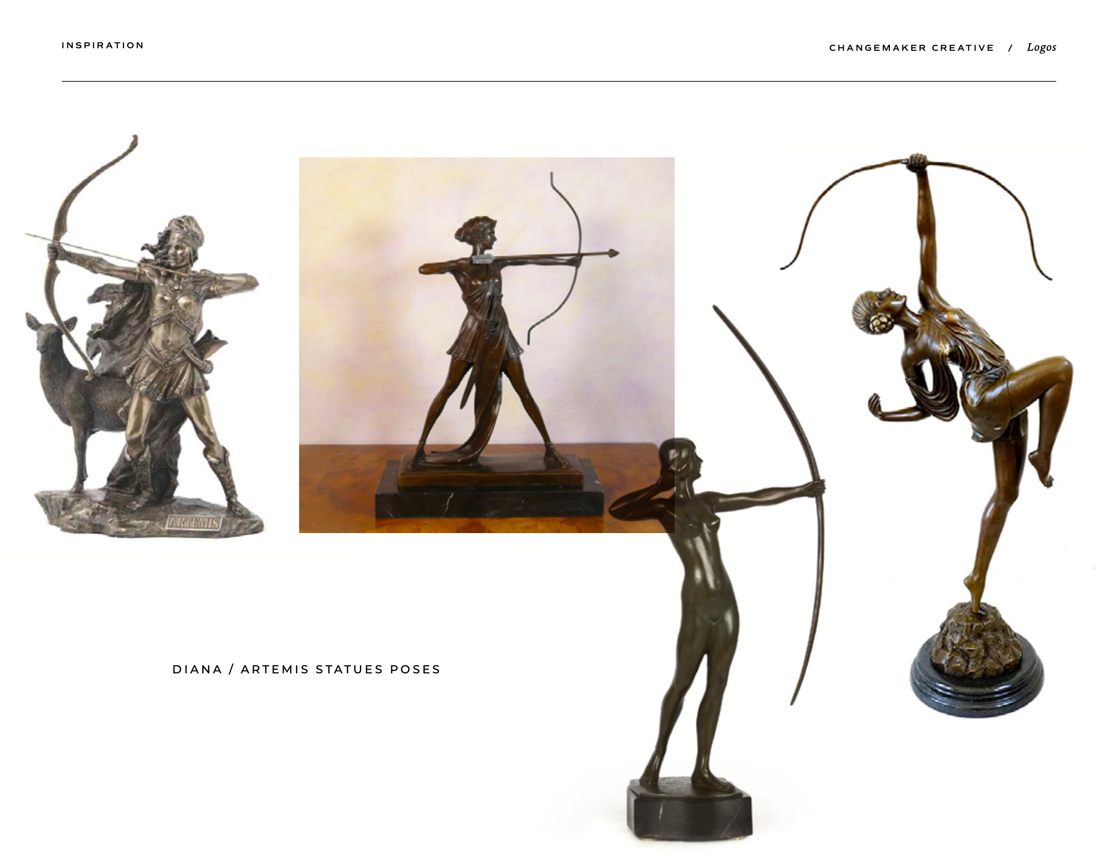
The inspiration to the brand was the moon and stars, the Goddess of which is Artemis (or Diana in the Roman lexicon)
Artemis the huntress is amazing: she is strong, she travels by moonlight, she is one with nature, and soil. She’s also a badass with a bow.
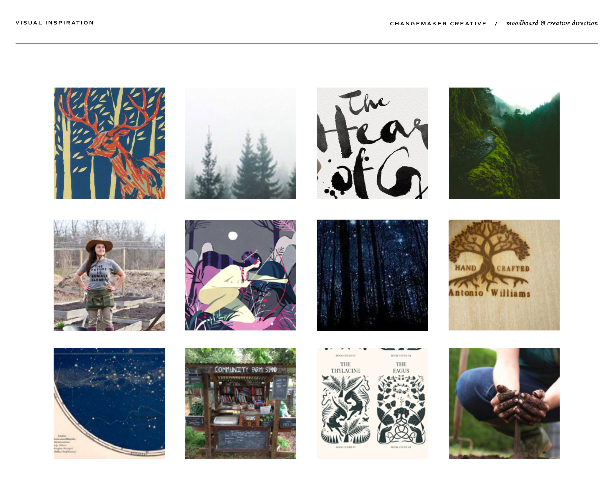
As part of the branding project, I gathered inspiration based on discussions with the client. We decided to take a stand against corporate cannabis, and celebrate the small female farmer.
Small farms can stand out my highlighting the handcrafted “farmstand” quality – this ain’t factory farm weed.
This can expand to the brand via handcrafted elements and a subtle rustic mood similar to artisanal cheese
or distilled spirits. This makes the product feel personalized, and like it was made by real humans, for real
humans. There’s romance in small farms, a realness that can’t be replicated.
Moonlight. Farm stands. Fog and moodiness of the Pacific Northwest.

Celebrating craftsmanship: artisanal and handmade
The idea for the branding + packaging was to utilize things like stamps, and writing on labels by hand, and lots of handdrawn elements to highlight the artisanal nature of it all.
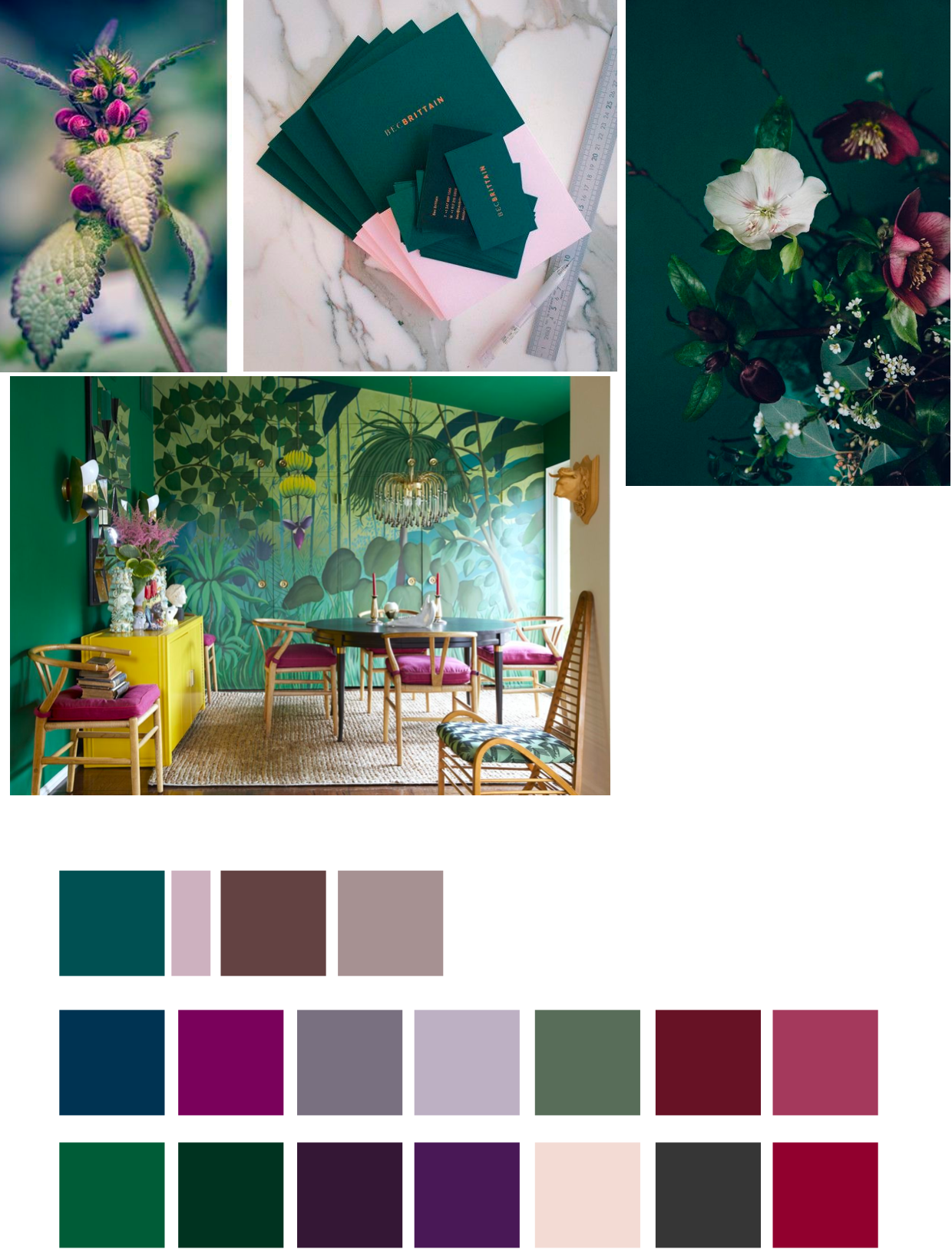
Color palette explorations: deep greens and jewel tones
Initial color palette inspirations included dark purples and jade greens, regal carmine reds and faded soft pastels.
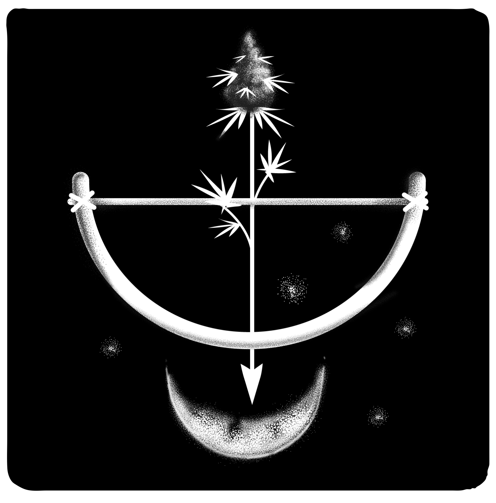
Custom illustration evoking sacred geometry and archery
To not get too girly and fancy, early illustration sketches included the actual bow, in a simplified shape.
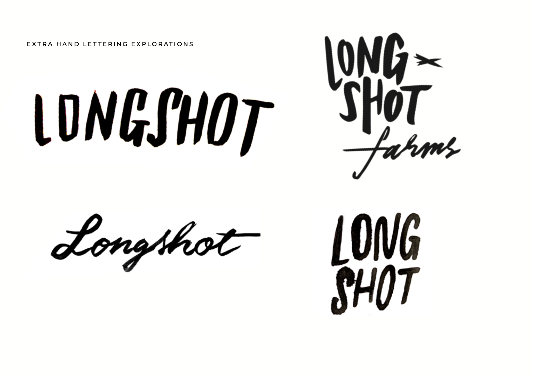
Early sketches explored casual styles and more sweet styles
Done with real ink and paper, to get actual analog roughness into sketching
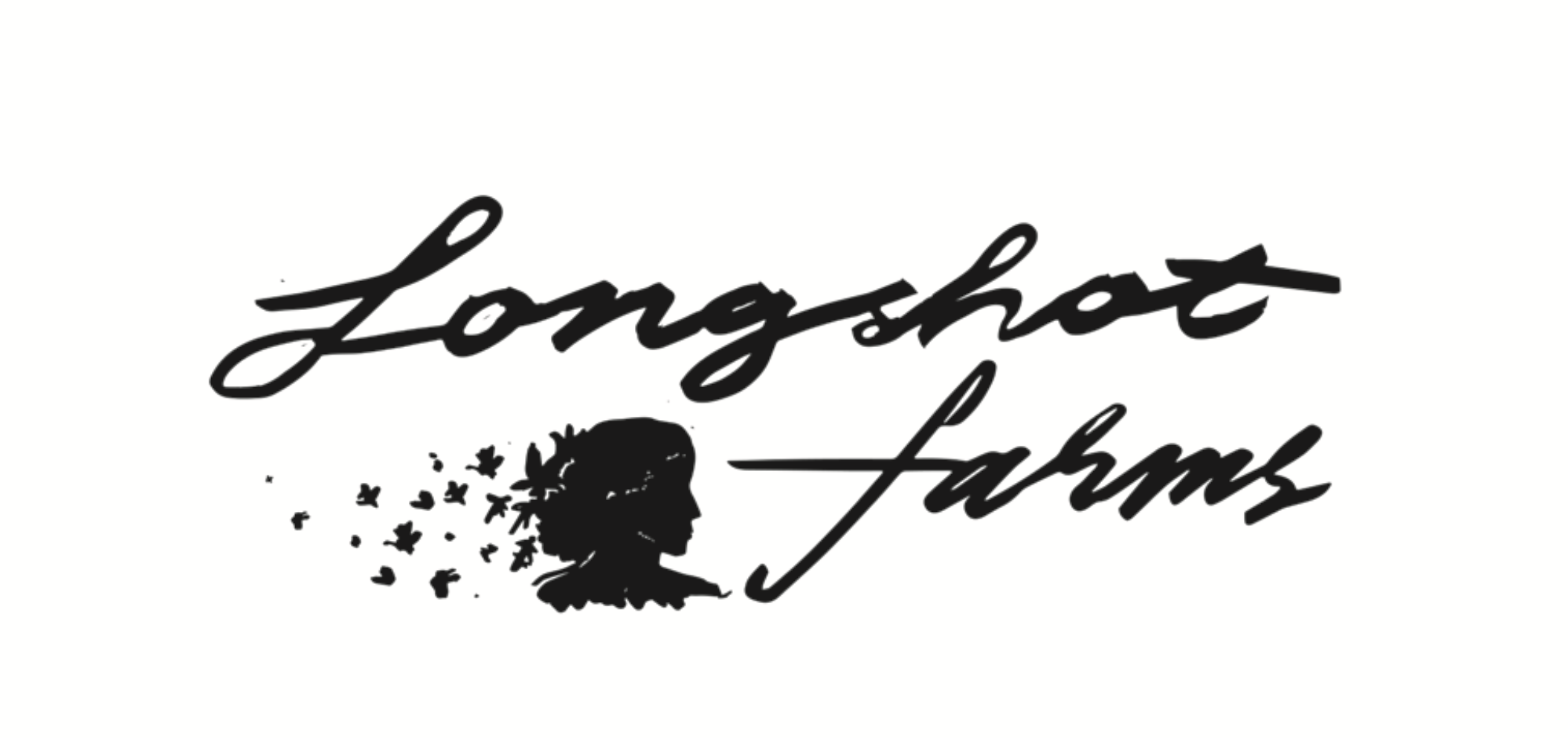

Last draft designs explored a more Art Deco type style to take the brand into a less playful look.


Ready to start your packaging project?
