GROCERY STORE FOOD PRODUCT LABEL DESIGN
Case Study: beer packaging
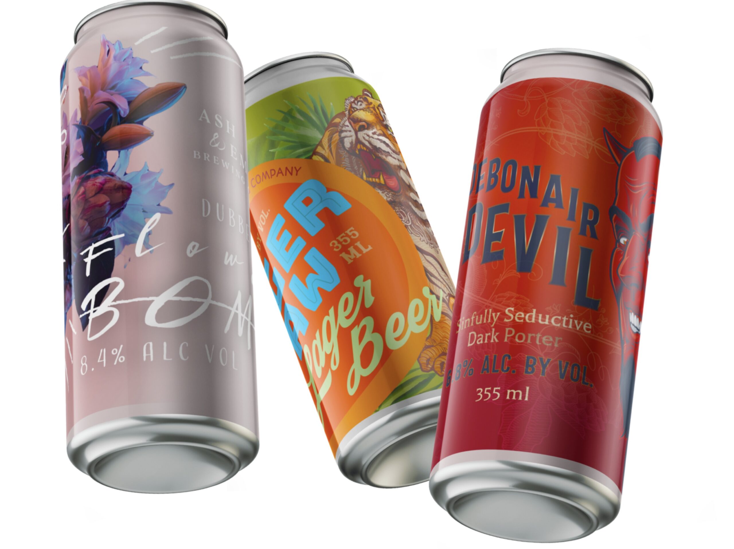
Printer company food labels showcase design example
Showing off the capabilities of a label printer through realistic looking, but fake food brands.
CLIENT: Prose Media
CONTENT + BRIEF: from the client


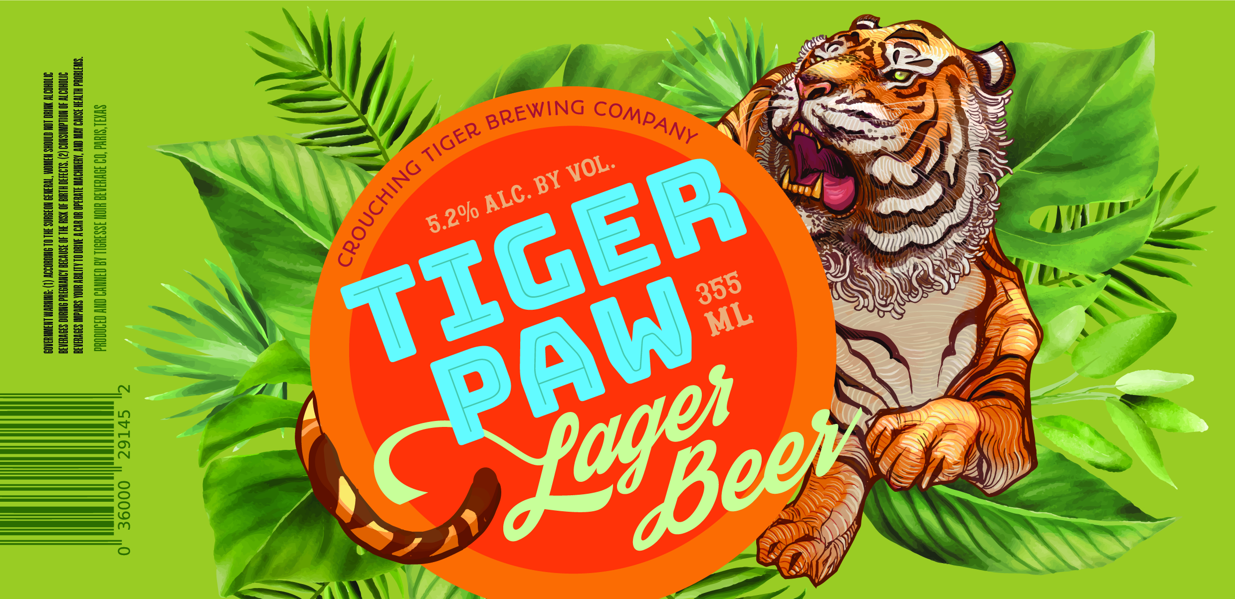
Utilizing some stock illustration materials, design and layout for a lager beer label for a beer can
The label was on a metallic material, so the leaves shimmered. The text inside the circle was also glossy, while the circle was matte. Using retro style fonts for that classic summer beer look. Name and copy from the client.

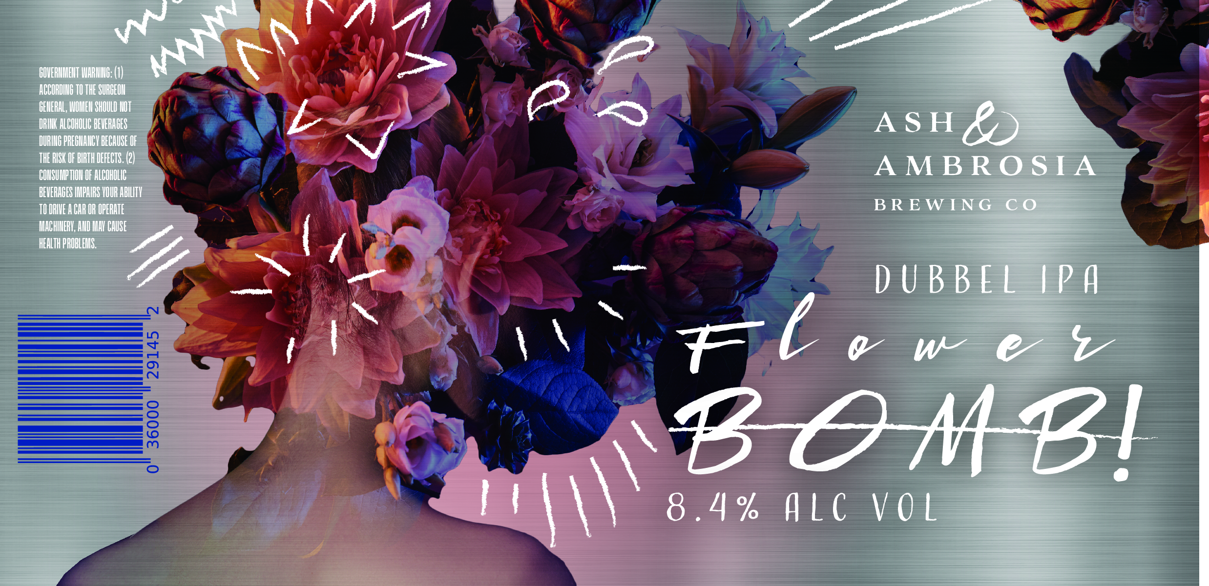
This design was a wildcard design, where the client let me come up with the whole thing, idea, name, whole concept. The design idea is to utilize the silver surface of the beer can, and making the label clear, with white ink. Some elements, like the flower head photo, blend on top of the metallic can surface, and the white ink printing doodles and text stands out.
These designs were all shown off FLAT, hence the designs not taking into consideration how it wraps around the container.

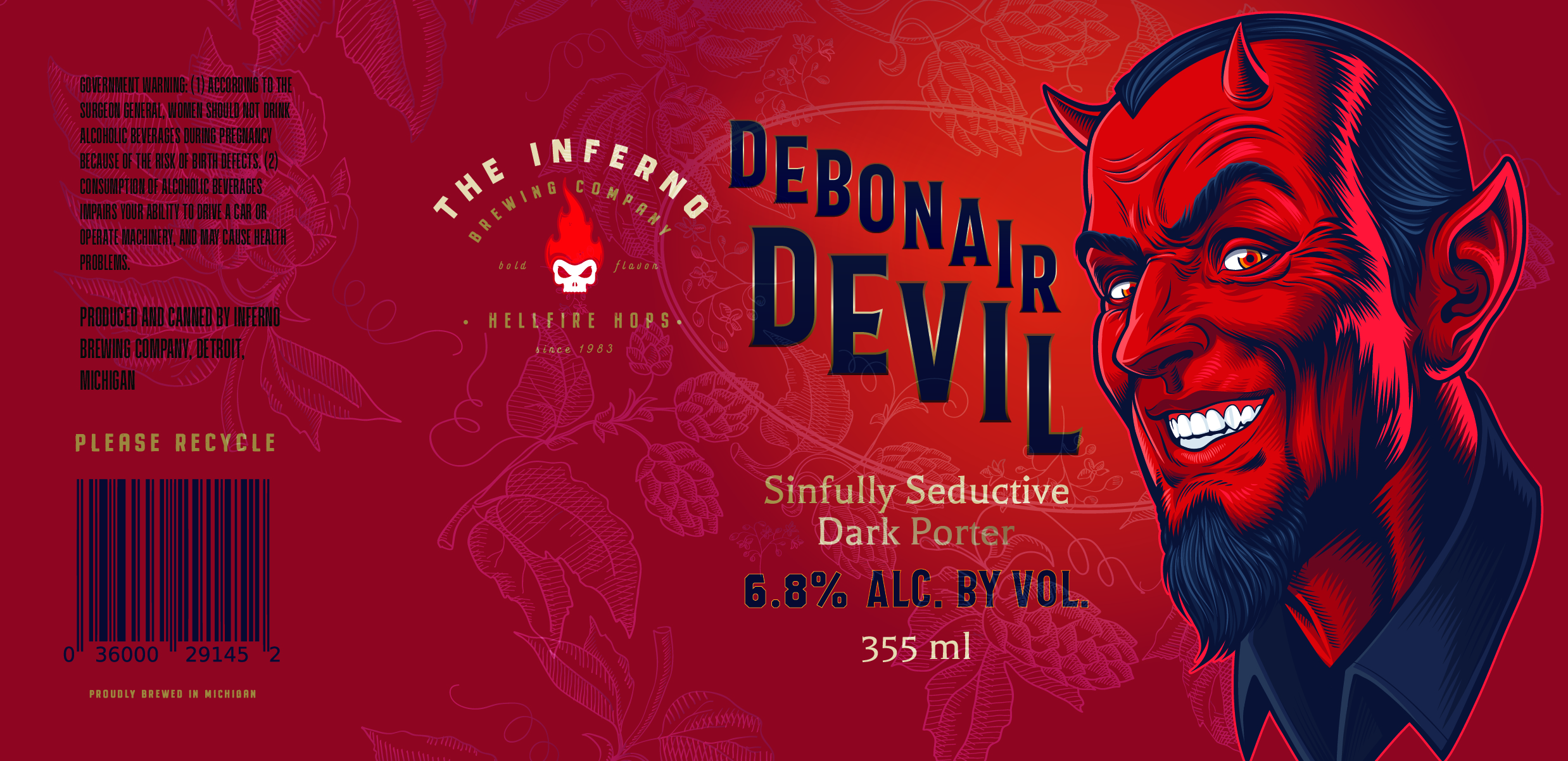
This concept and name came from the client. The brief was to show off the metallic + detailed printing capabilities and smooth gradients. The character illustration (modified stock illustration) has fine details, there’s gold text, and also a tone-on-tone gloss print on the background. While this concept was not my personal favorite, I did get a chuckle out of the fictional brewing company logo and name that I created for this one!
These designs were all shown off FLAT, hence the designs not taking into consideration how it wraps around the container.
Ready to start your packaging project?