PRO SPICES FOR HOME CHEFS
Chef Salt
Packaging refresh for a food brand
Skills: design, compliance, copywriting, press-ready files
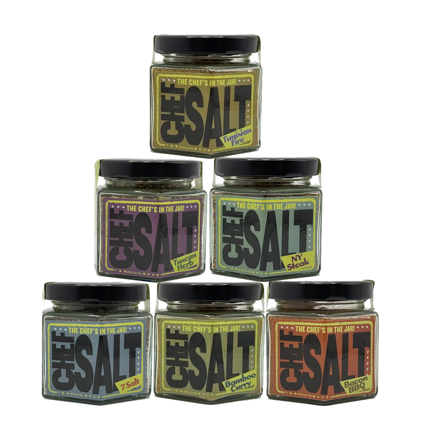
The problem: the old, 1990s style packaging didn’t work in ecommerce, getting lost on the results page and being unclear as a thumbnail. So Chef Salt, a gourmet salt and spice mix company, came to me needing a packaging refresh! The existing product line was fine, just needed improved packaging, both to better stand out on the virtual shelf of big retailers, as well as practically to better align with modern needs for ecommerce shipping requirements.
All this needed to happen while retaining the essence of the original brand. I created new labels, a brand color scheme, and utilized illustrations and texture to attract the foodie audience, and we changed the jars from expensive and heavy glass to a lighter weight, less breakage-prone package, which also results in a sustainability win.
existing packaging
Hard to read, outdated in style
New labeling
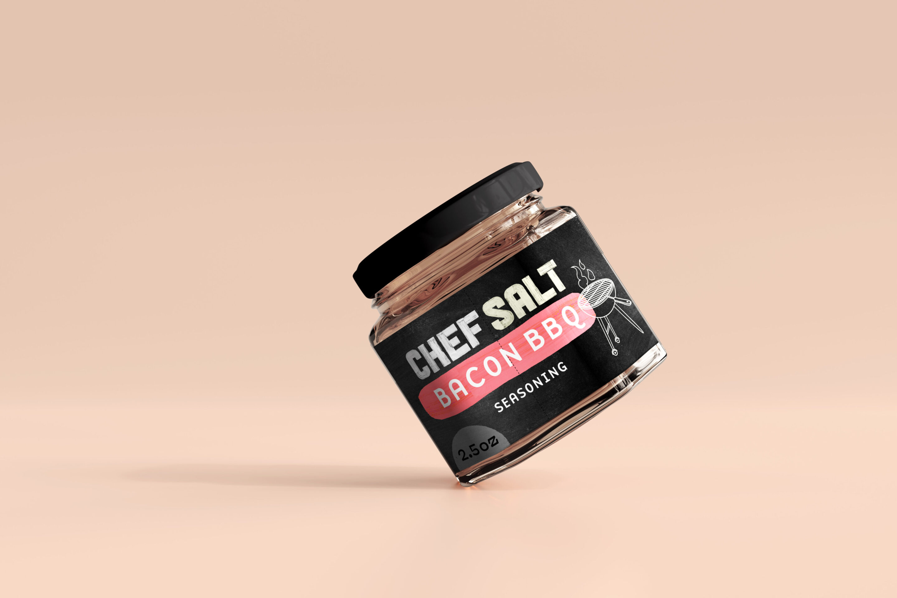
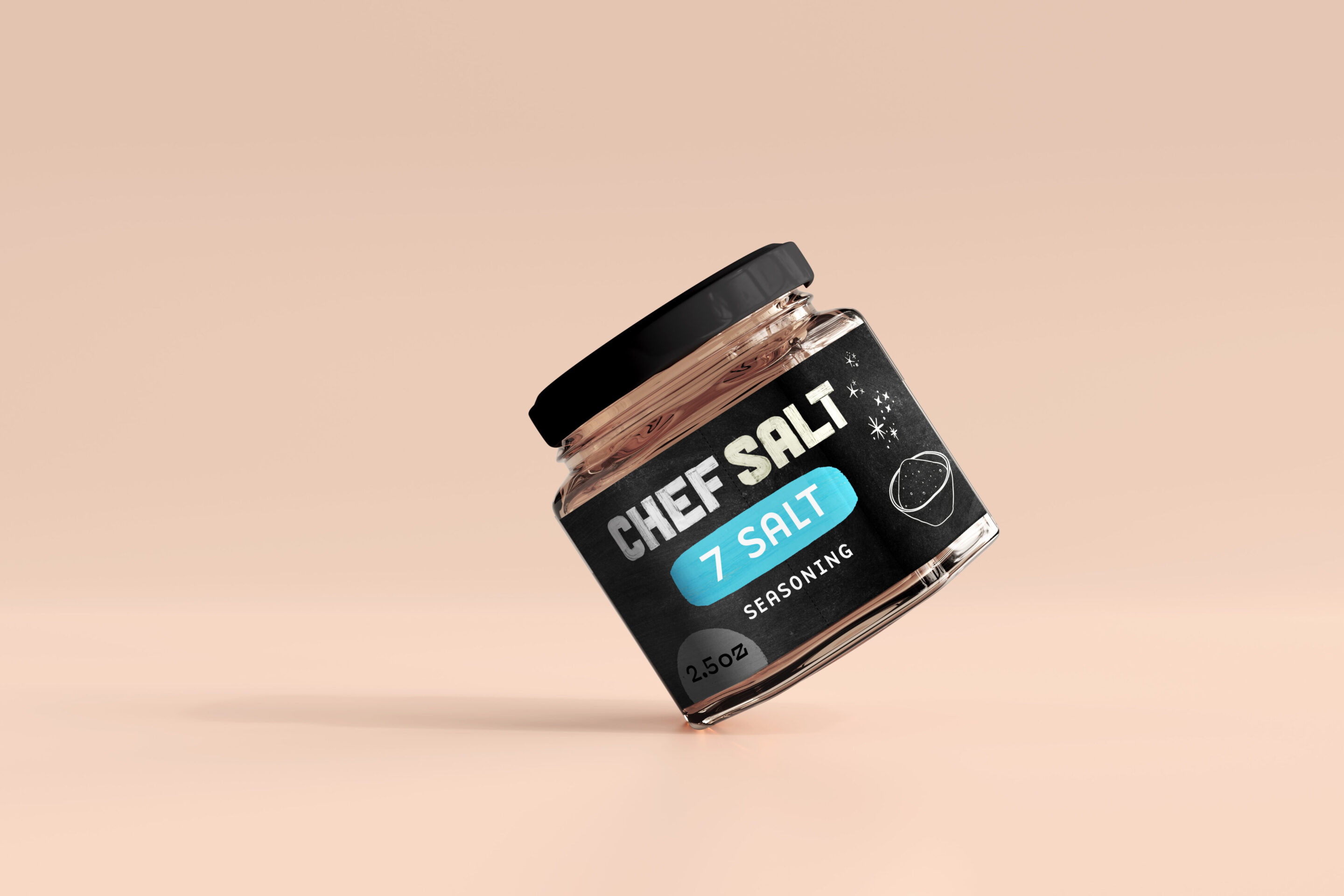
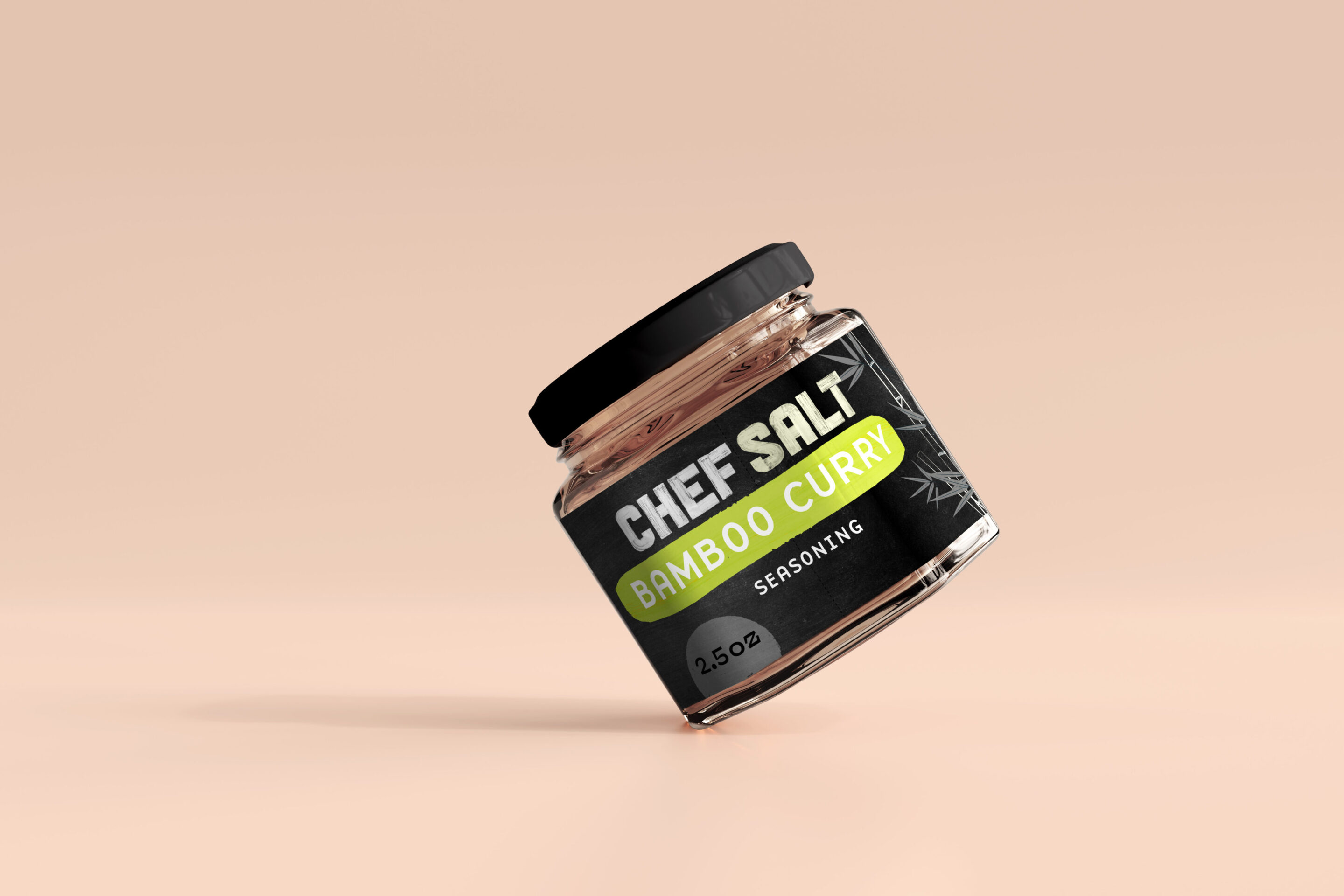
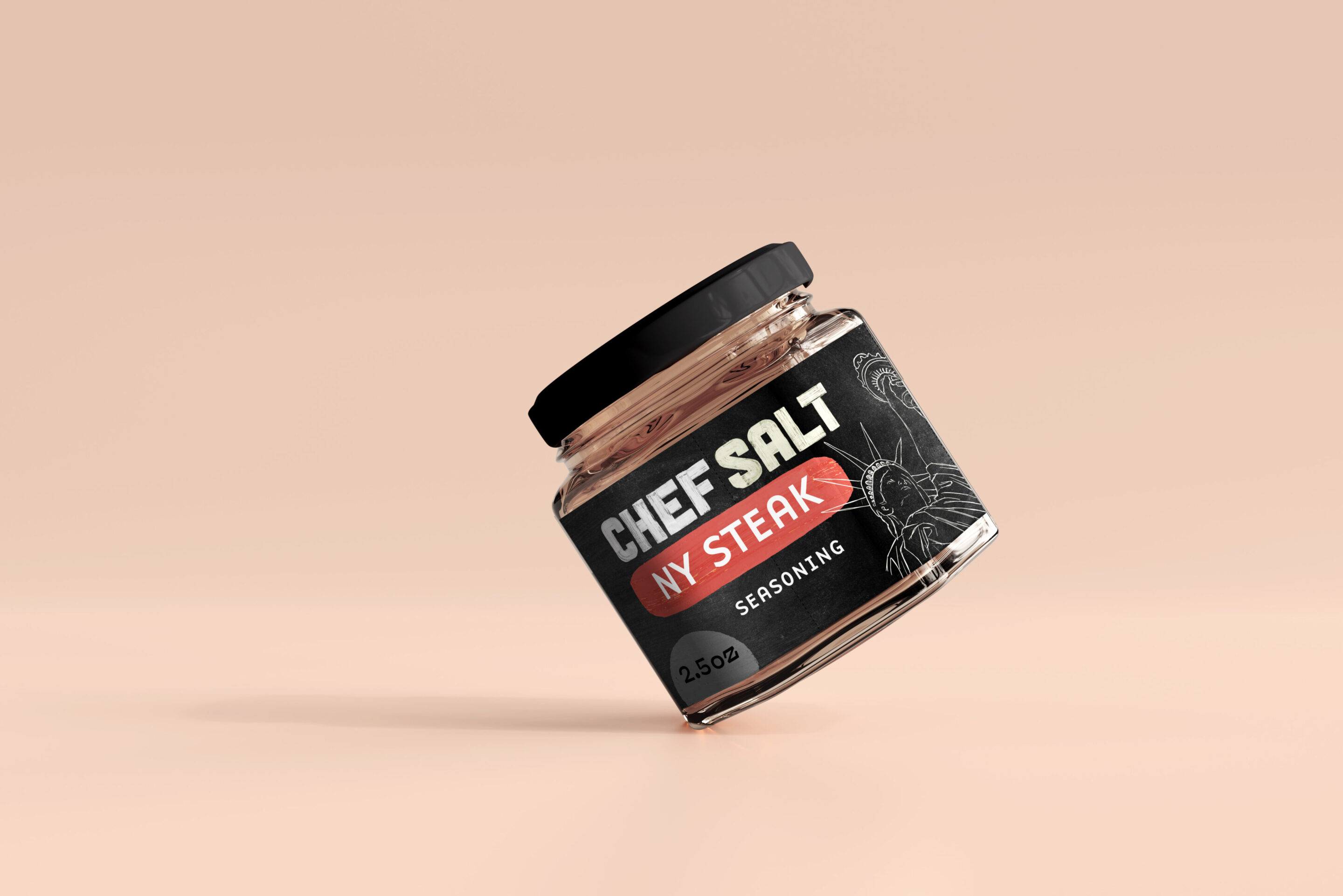
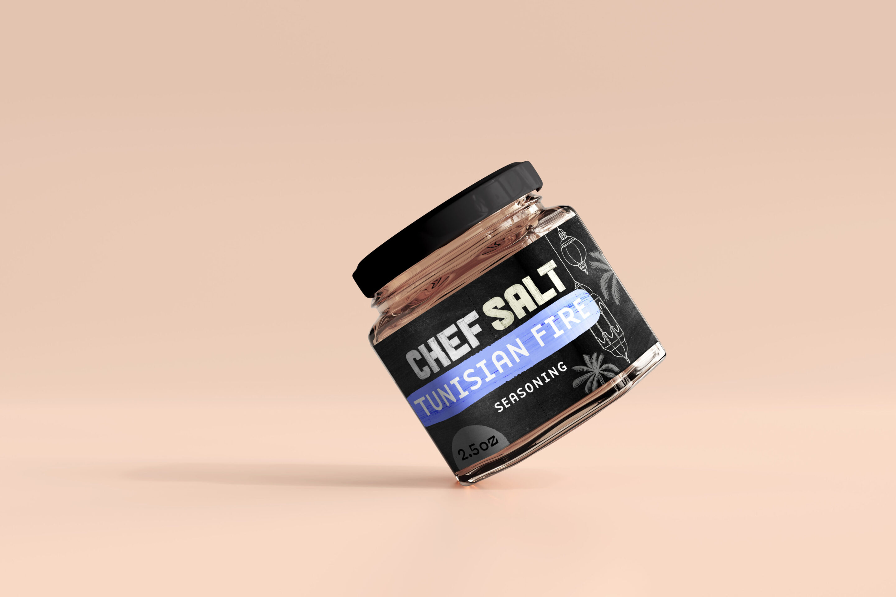
New box concept, secondary drafts of labels, copy
Lighter weight plastic container, with a clear window, and more realistic spice depictions and images were part of a secondary exploration during this project. The spices shown on the spoon reflect what’s inside.


Tertiary drafts of label concepts
Changed some of the flavors out, and went with slightly more refined and “Williams Sonoma-y” design with real photos in addition to the illustrations. I did also write the copy, source the images, and offer regulatory assistance in adhering to food packaging rules, such as the iodide warning required on salt products that are not iodized. Writing the little descriptions for each of the flavors was a lot of fun, as a foodie!


Ready to start your packaging project?
