CANNABIS INFUSED SKINCARE COMPANY
Skincare rebrand
Green Bee Botanicals – THC topicals skincare
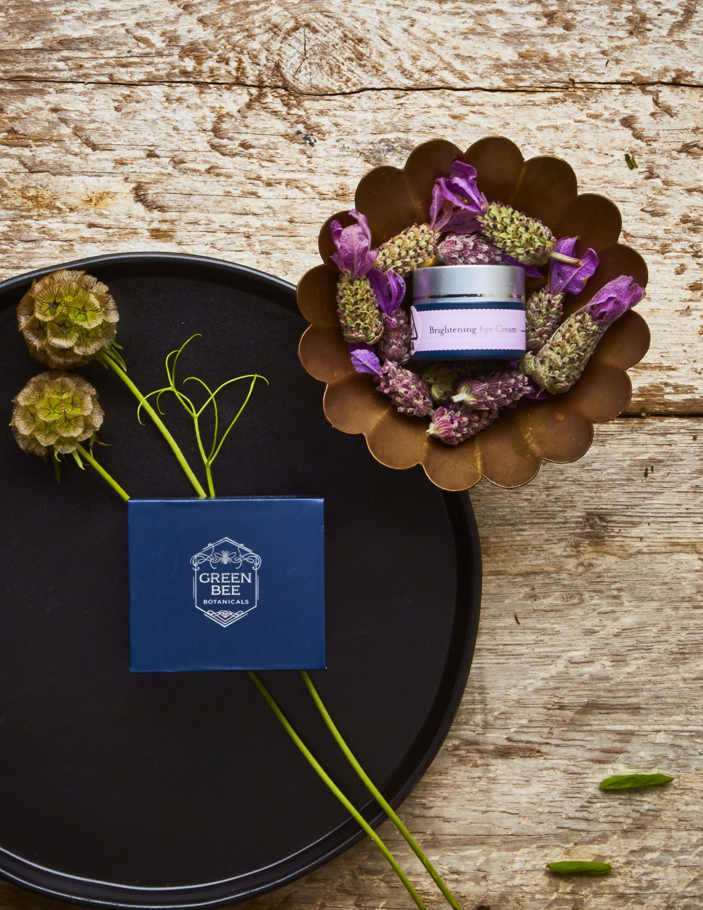
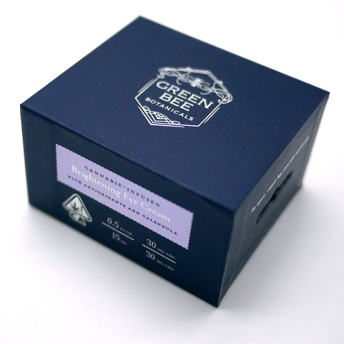
Green Bee Botanicals is a California cannabis-infused line of skincare products, only sold in dispensaries for 21+. Cannabinoids and organic herbs are brought together for their medicinal properties in scientifically-based formulations, including Emerald Cup winning Eye Cream, and fan favorite Massage and Body Oil. High-end ingredients and formulations required higher-end packaging. As an added hurdle, we needed to find skincare packaging that would be child resistant.
See also: Original branding project
See also: Hemp CBD product line
CLIENT: Green Bee Botanicals
PROJECT: Packaging design, branding, copywriting, compliance consulting, launch strategy, packaging sourcing
The year? 2018. California was was legalizing adult-use cannabis, after being a medical-only state from the 1990s. The boom was on, and Bridget May, a chemist, had been creating healing topicals from her kitchen in San Francisco. But now it was time to join the big leagues and create a licensed cannabis THC skincare brand, a first of it’s kind!
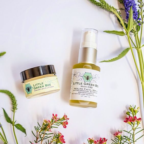
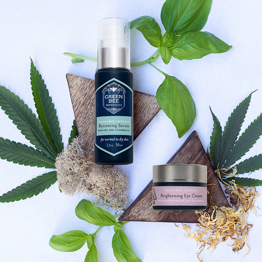
LEFT: Original Packaging – prior to the rebrand
RIGHT: Same products after rebrand
The client wanted to keep elements of the old logo, including the bee icon, and the typeface, Copperplate. We worked on renaming the company, which had been named Little Green Bee, green for cannabis and the environment, Bee for Bridget. We added the word Botanicals to the name to give it more gravitas, and lean more into the herbalism, botany, and science aspect. We wanted it to feel like a vintage apothecary.
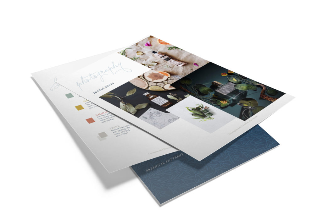
Brand book included colors, and fonts, and logo guidelines, but in addition, guidance for other design assets that didn’t yet exist – photoshoot styling, social media styling, icons, patterns, etc. Comprehensive brand guide for future projects, as we had not yet done any photoshoots at this time.
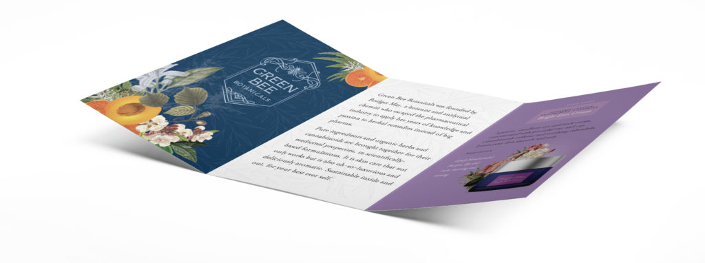

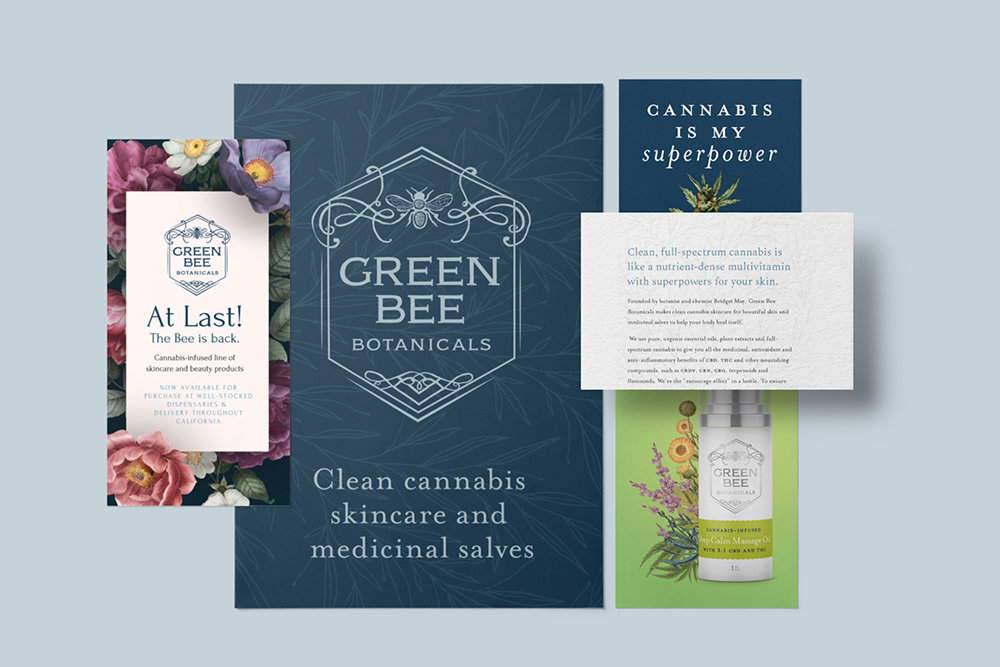
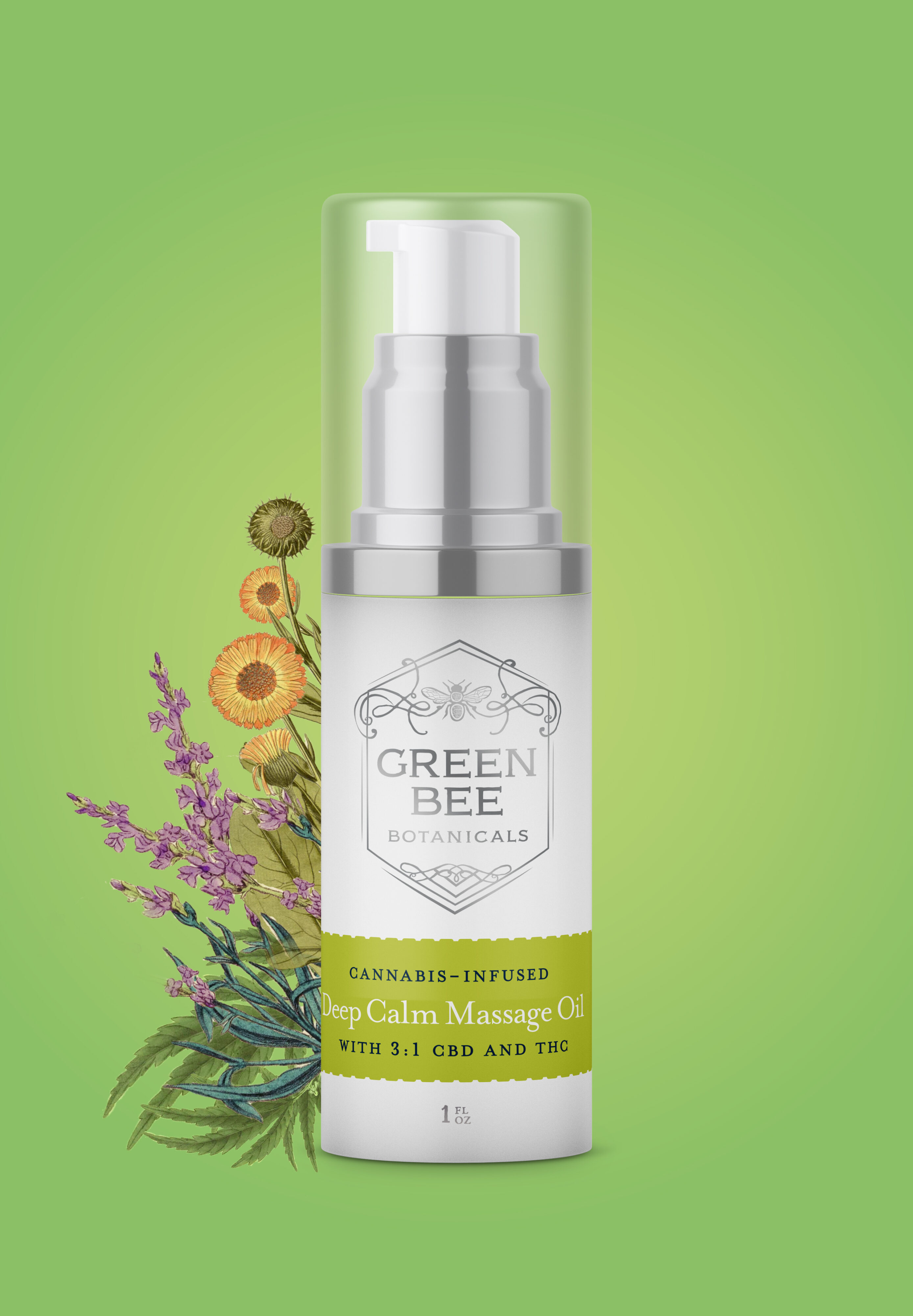
Brochure and product cards design – each product had a mockup image, and a graphic made with vintage botany art – highlighting the ingredients inside each product.
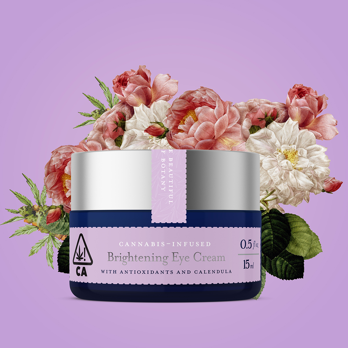
Brochure and product cards design – each product had a mockup image, and a graphic made with vintage botany art – highlighting the ingredients inside each product. These were used in sales sheets, online, and socials before we had the physical packaging, and a photoshoot done.
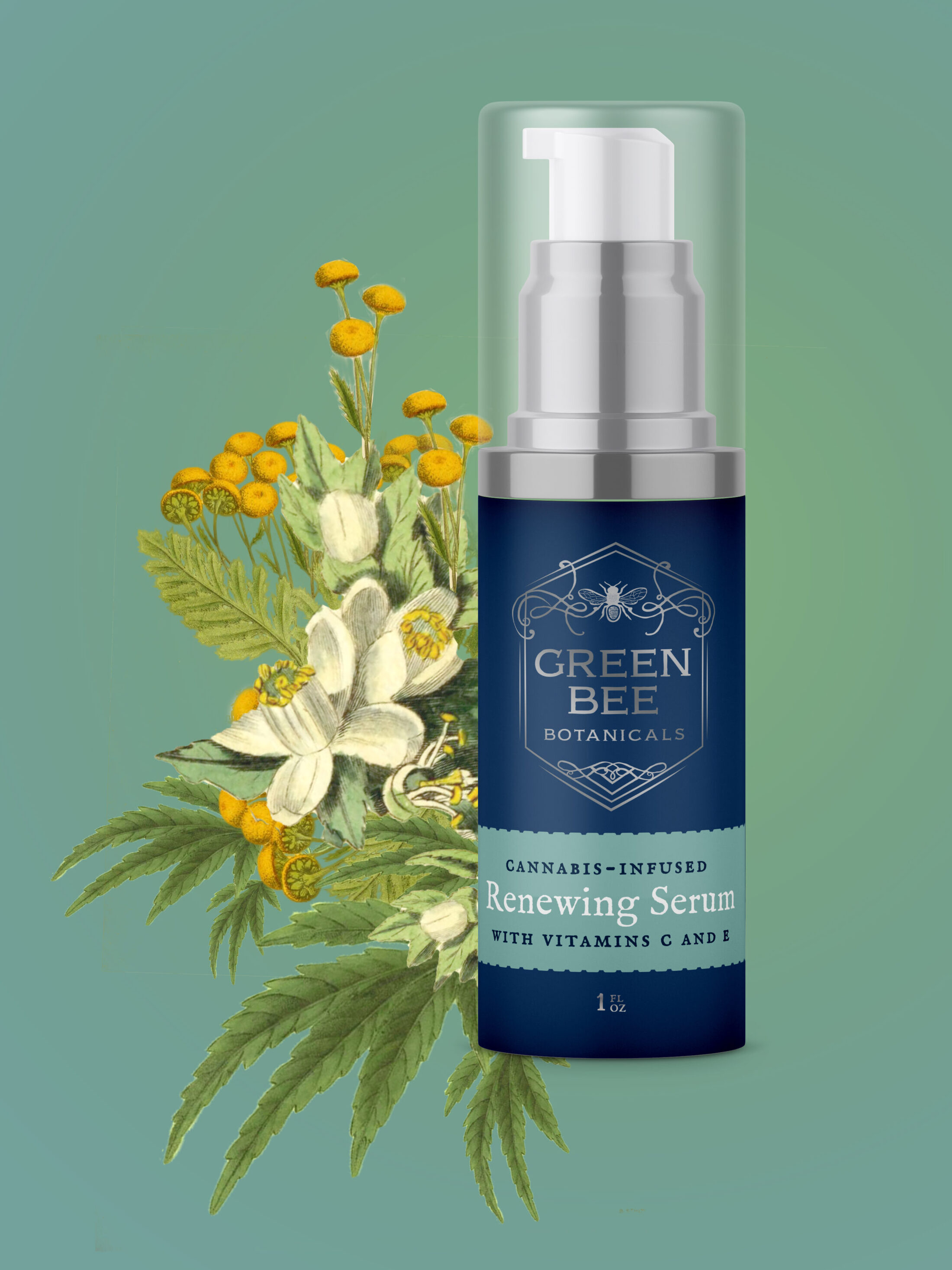
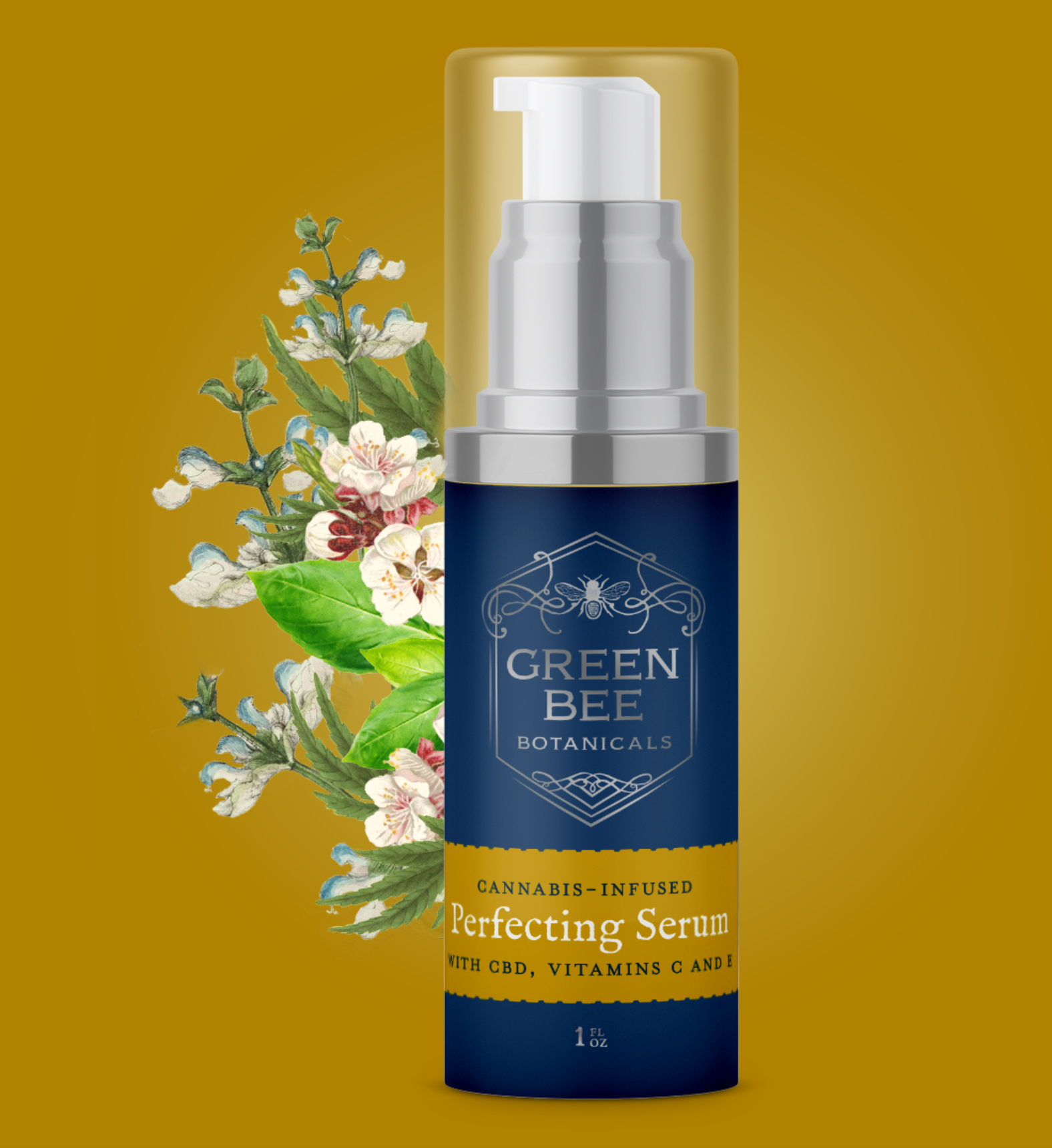
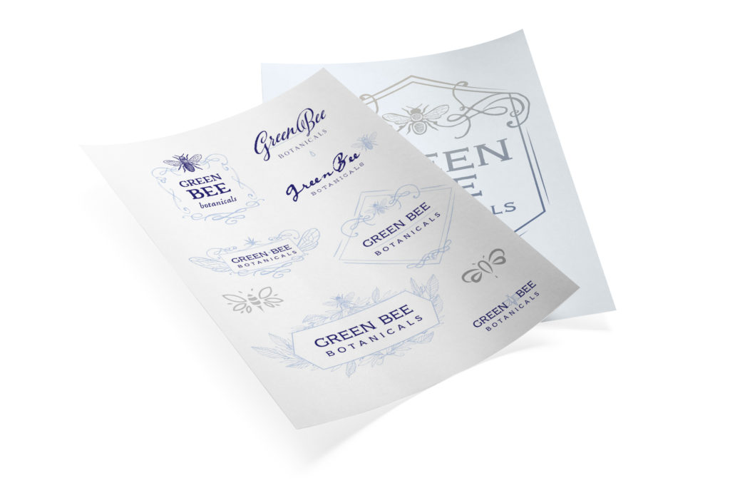
Logo sketches explored a wide range – some very frilly, some more simple. In the end, we kept the elements from the original logo, the bee, and added a filigree frame for elegance. Wanted the logo to feel old, like it had existed for hundreds of years, in letterpress. It looked lovely in foil.
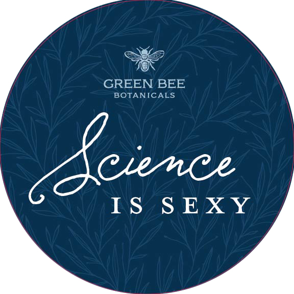
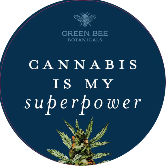
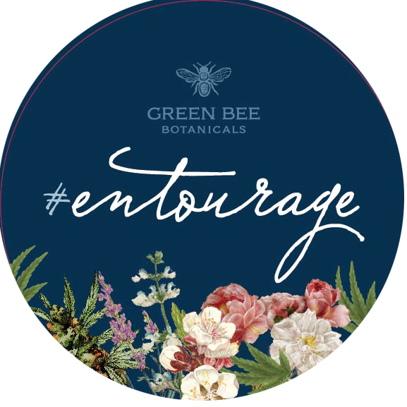
Launch party included custom buttons, and these photoshoot prop paddles, with brand-appropriate statements – entourage effect is where cannabinoids work together for a greater effect. The cannabis is my superpower was the most popular one.
Ready to start on your custom branding project?
Schedule a call to talk to me, a strategic branding expert for companies of all sizes
