HEAVENLY CANNABIS FLOWER
Case Study: Rize Cannabis
Packaging and branding for upstate New York licensed cannabis company
Rize Cannabis, Rock Tavern, NY
Hemp and cannabis farm, newly licensed in the new NY legal weed market.
Client’s goal was simply launching a new brand in a new market, and didn’t really have a clear idea on how to get there.
So I ran the client through my strategic branding workshop, finding out what made this company and farm special. What we found out, was unlike many others, the competitors were simply whitelabeling for out of state multi-state-operators. So to differentiate, we wanted to make it truly a local brand that celebrates the beautiful Hudson valley area. We took on the task to create a truly indie brand unique to the New York cannabis market, and establish the farm as a first to market leader.
Design process
I always work on the ideas and words first, then the visuals come after. The visuals should not be “frosting” just for prettiness sake, but communicate the bigger story.
Design statement explains how we want people to feel about this product:
A BRAND that MAKES YOUR AUDIENCE FEEL like you’re their caring friend who is also a trustworthy expert – an identity that feels easy, friendly and refined
Goals of the company:
1] This product is more than just chasing high THC levels
THE AUDIENCE is looking for unique feelings, and are celebrating the flower – savoring the flavors and terpenes and also aren’t about just the high or getting numb.
What this means is they will be coming out with more rare cultivars, with interesting flavor and terpene profiles, and not just going for the same high THC basic stuff everyone else is doing.
How this product helps the main customer:
2] We want to add the spark into their day and make it better
THEY WANT something that not only makes them feel better, but also tO heighten and add color & vibrance to the mundane.
Tone and mood words guiding the process:
FRIENDLY and approachable (but not silly)
PRAGMATIC and no-nonsense (truthful, straight, about science, not hype)
STYLISH and serene (maybe even a little dreamy and aspirational)
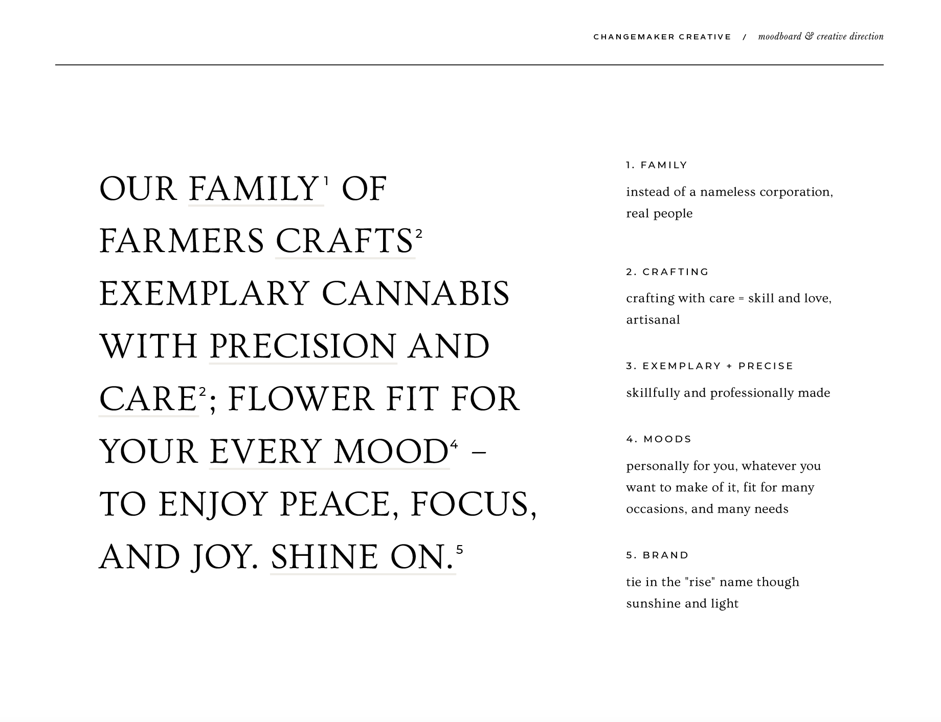
Visual inspiration for the brand
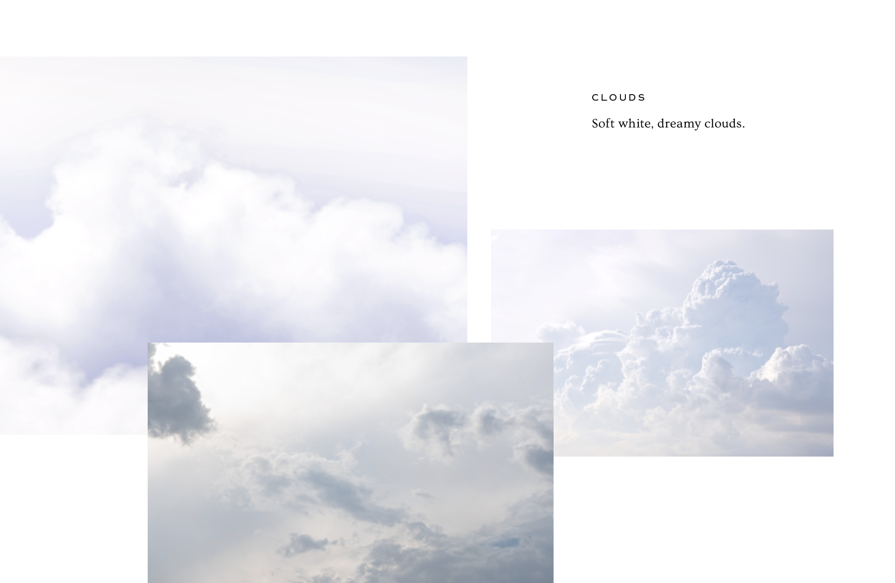
Gradients (evoking sunrises and the sky)
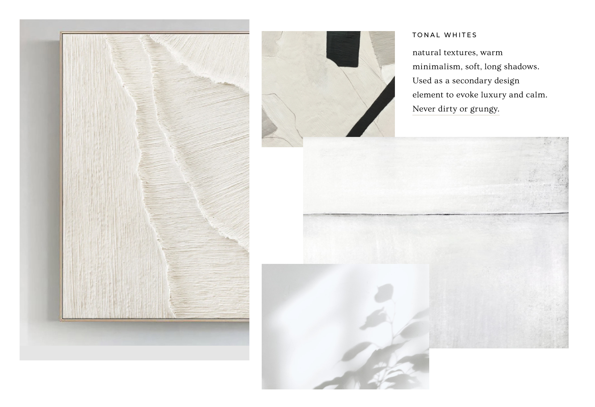
Tone on tone white graphics (for a dash of elegance and nature and higher end “beige aesthetic”
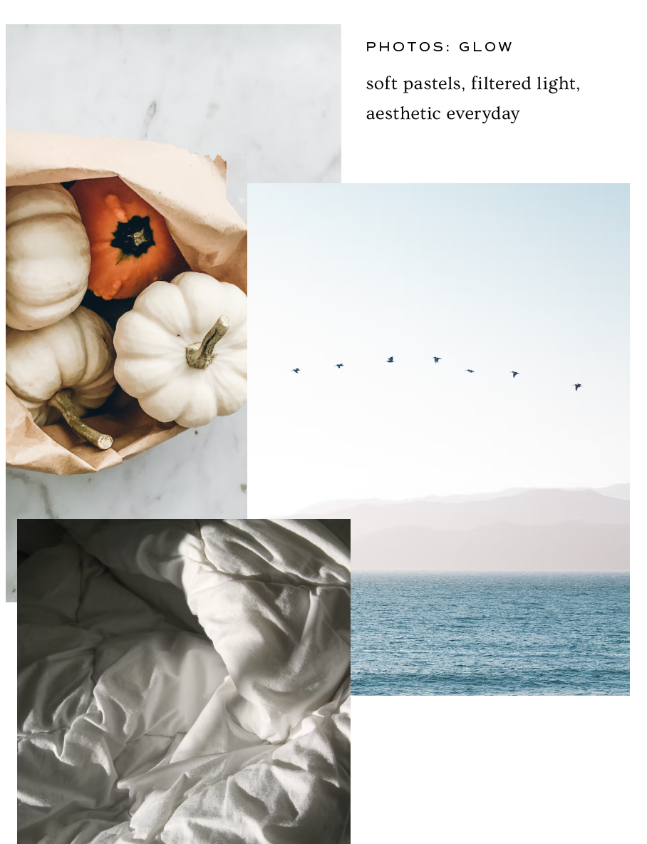
Nature “Kinfolk farm porn”
Logo concepts and sketching
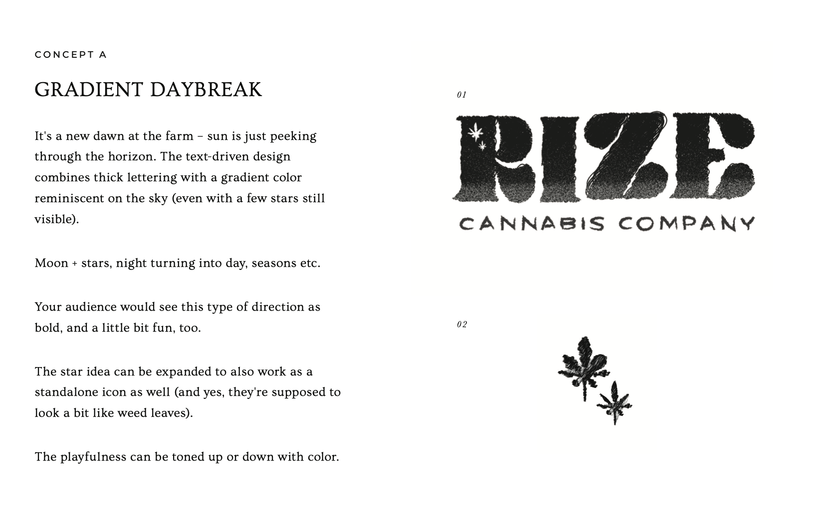
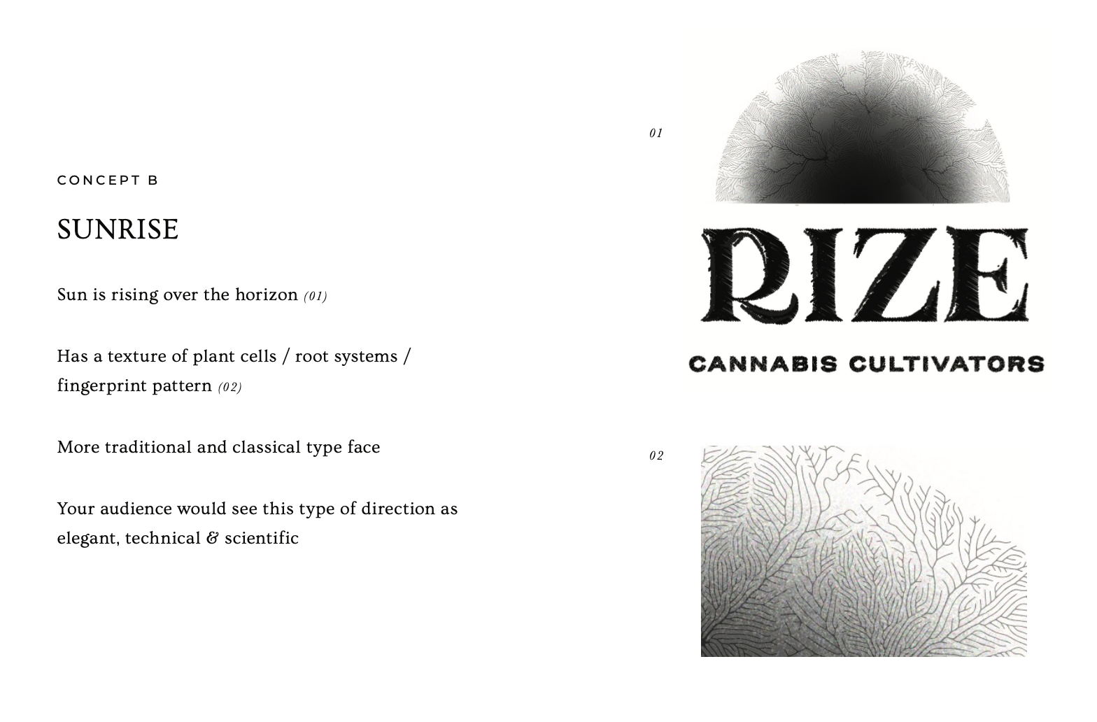
The main ideas for the logo were the idea of sunrises, the sun rising, and being high in the sky. So I explored some sketches, first time using an iPad for sketching instead of pen and paper. My first sketches are usually just simply idea doodles, not meant to be shown to anyone but myself, and I do a cleaner concept drawing that I show to clients as a first draft.
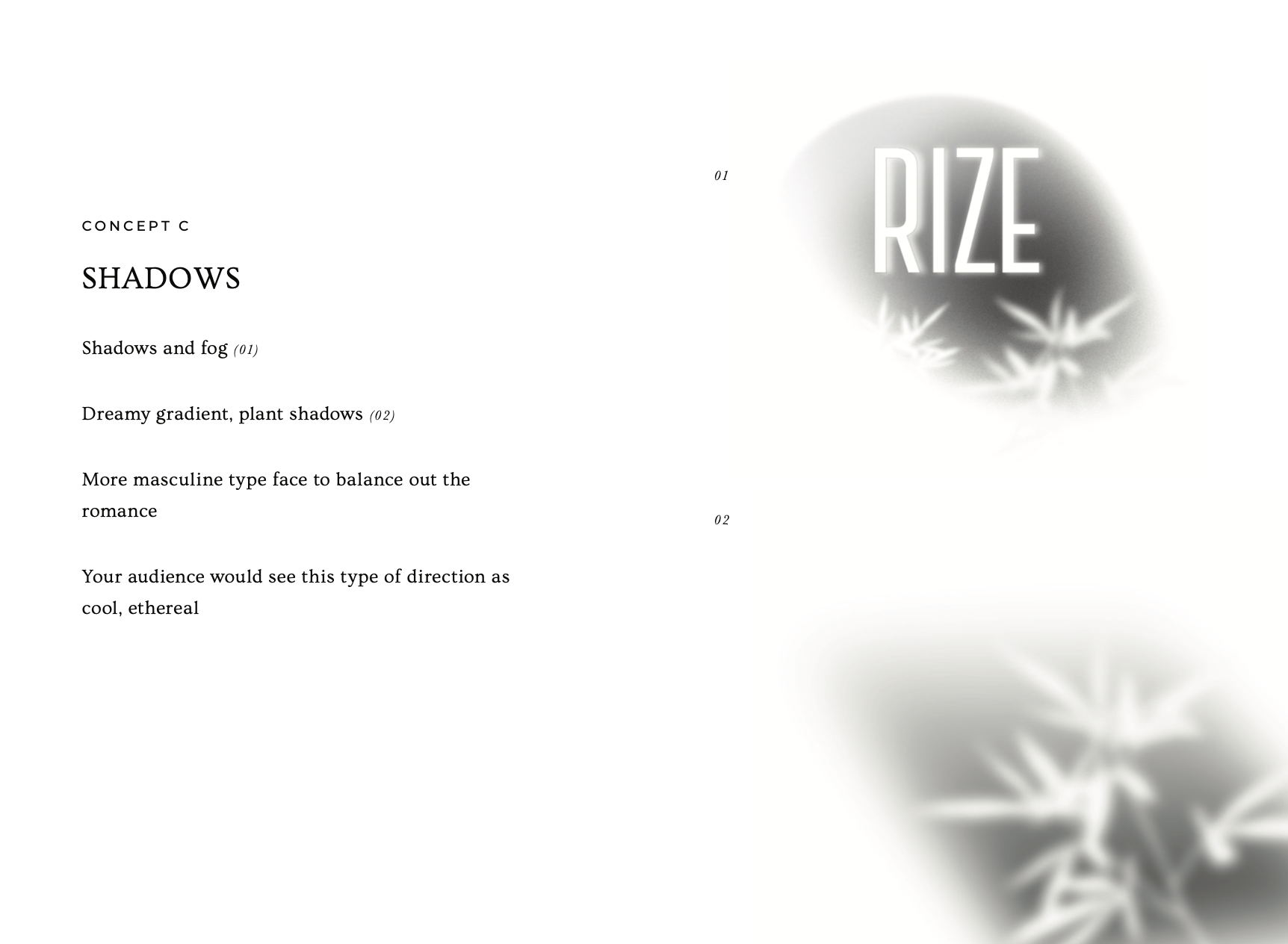
Here we had three original concepts (which spoiler alert, you can already tell one of them was pretty much what ended up being the final logo!)
Mine aren’t always a 100% hand drawn, like here on concept 3, it was just clearer to show the concept in a digital format.
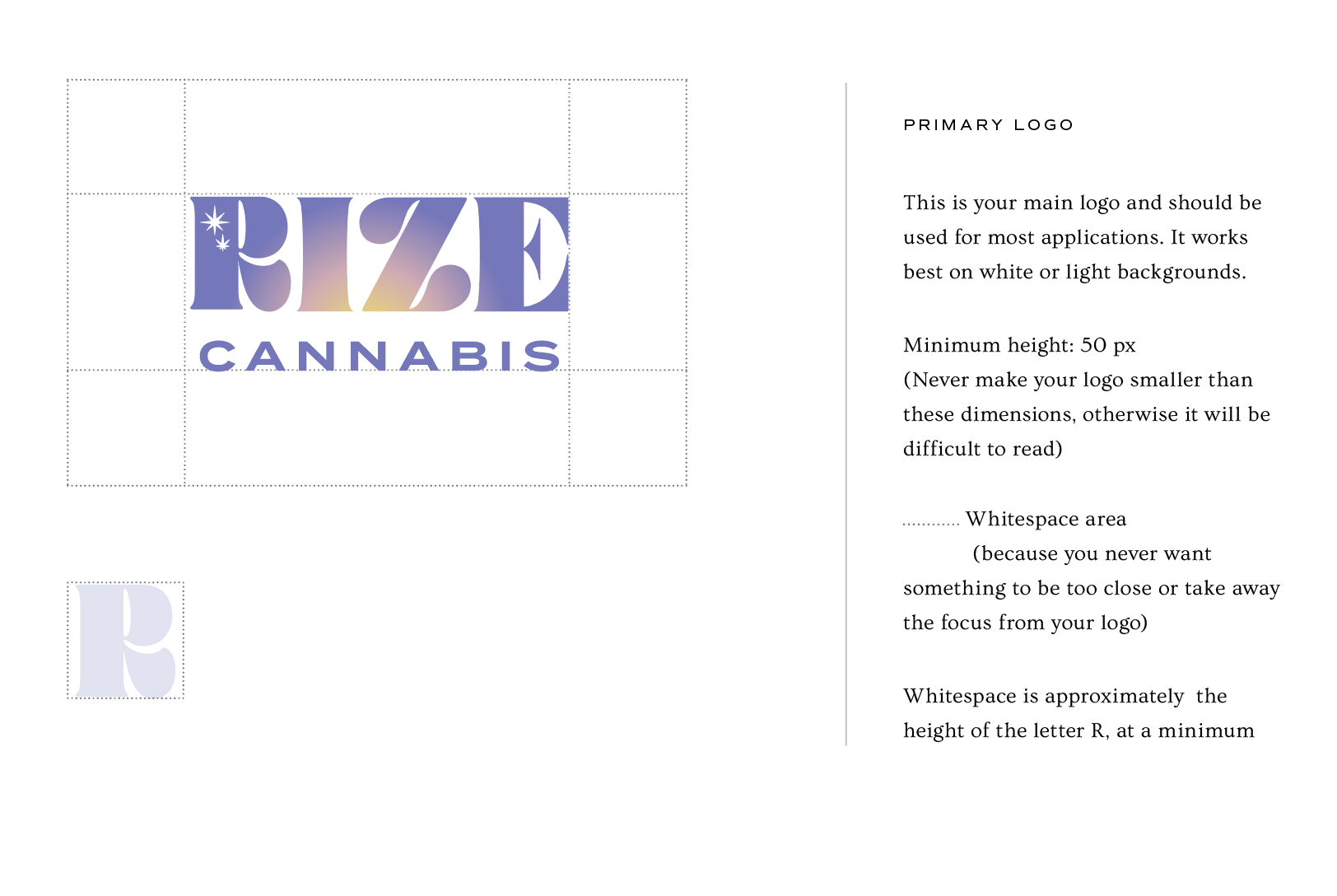
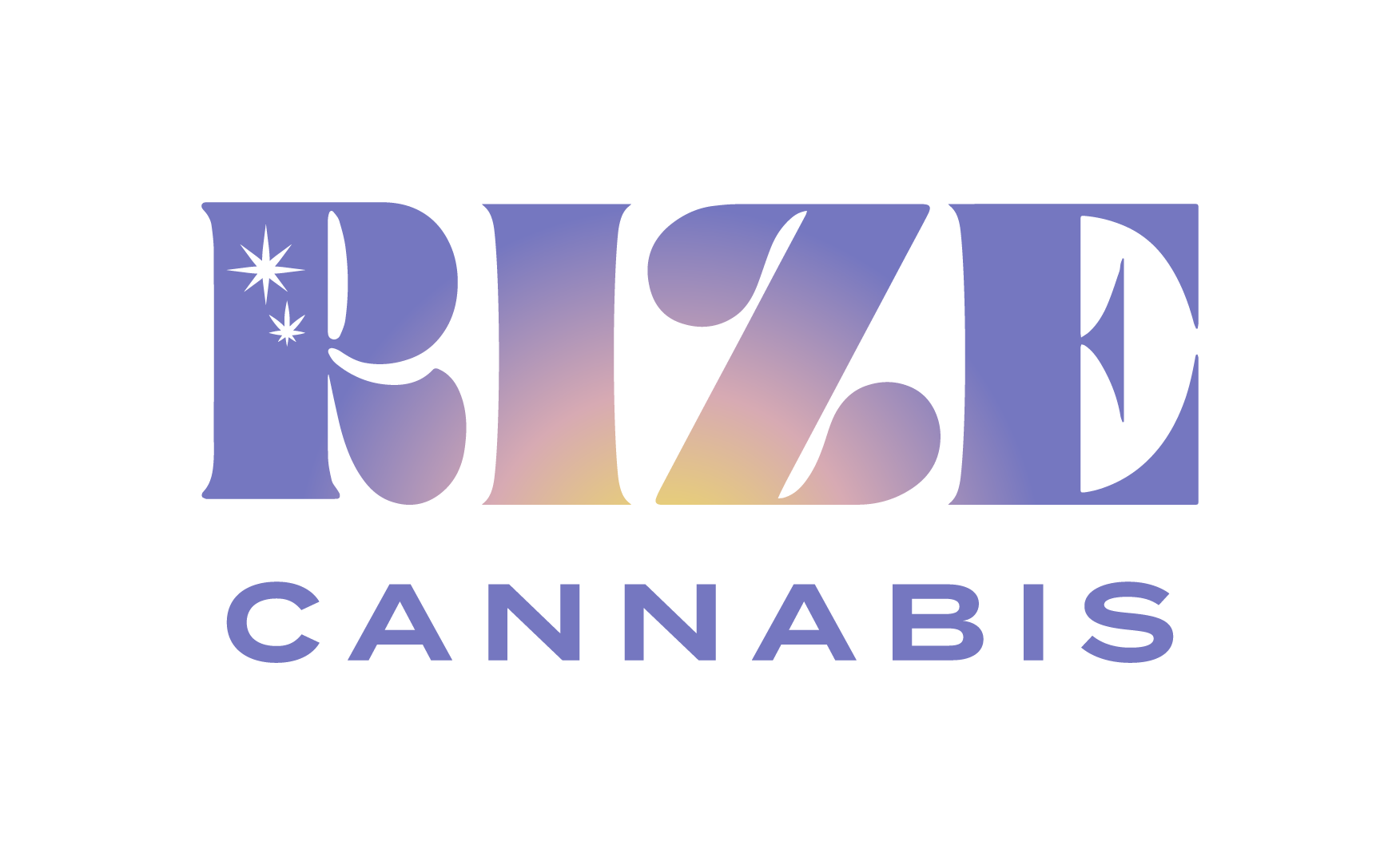
Final logo (ABOVE)
Gradient and cloud texture (BELOW)

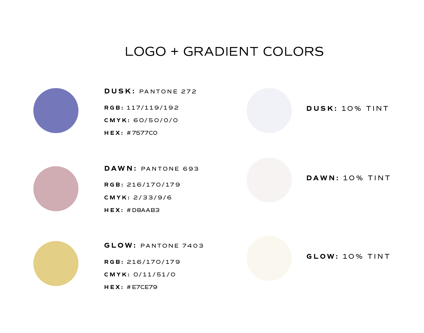
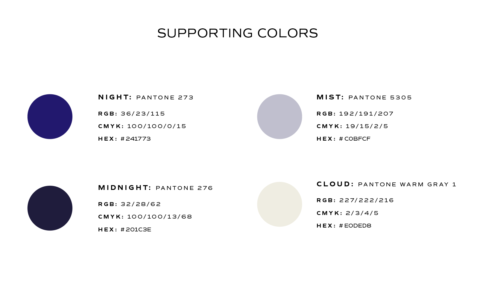
Brand guide comes with a color palette for the logo, AND for colors to use in design across mediums.
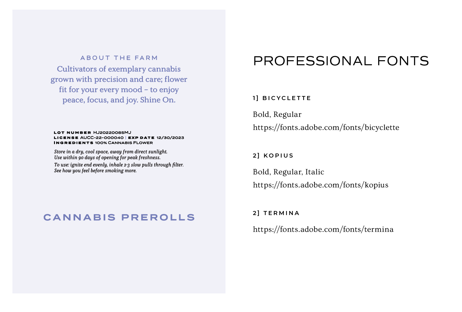
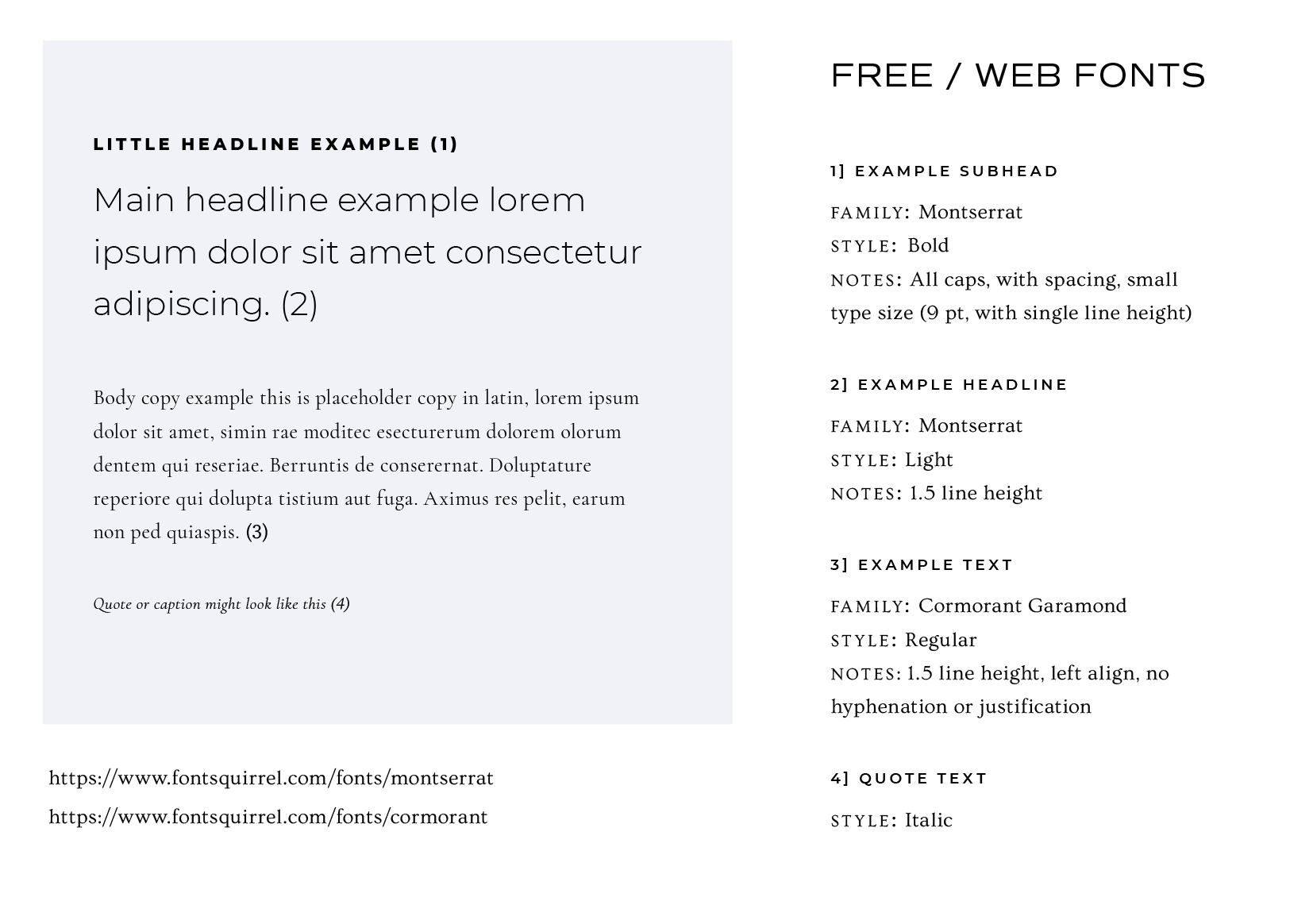
Font choices – thought out for all uses
For the packaging and brand assets I create, I tend to use “professional” fonts, only available for paid licensing. But I know using licensed fonts can sometimes be expensive, and complicated for small businesses, so I always plan for options that are free to use, and available on places like Canva and Google docs and the web. Gatekeeping is not my thing, I’d rather make sure everything created for the brand aligns with the vision, be it made by me, or the client themselves. I want to give clients the tools they need to succeed.
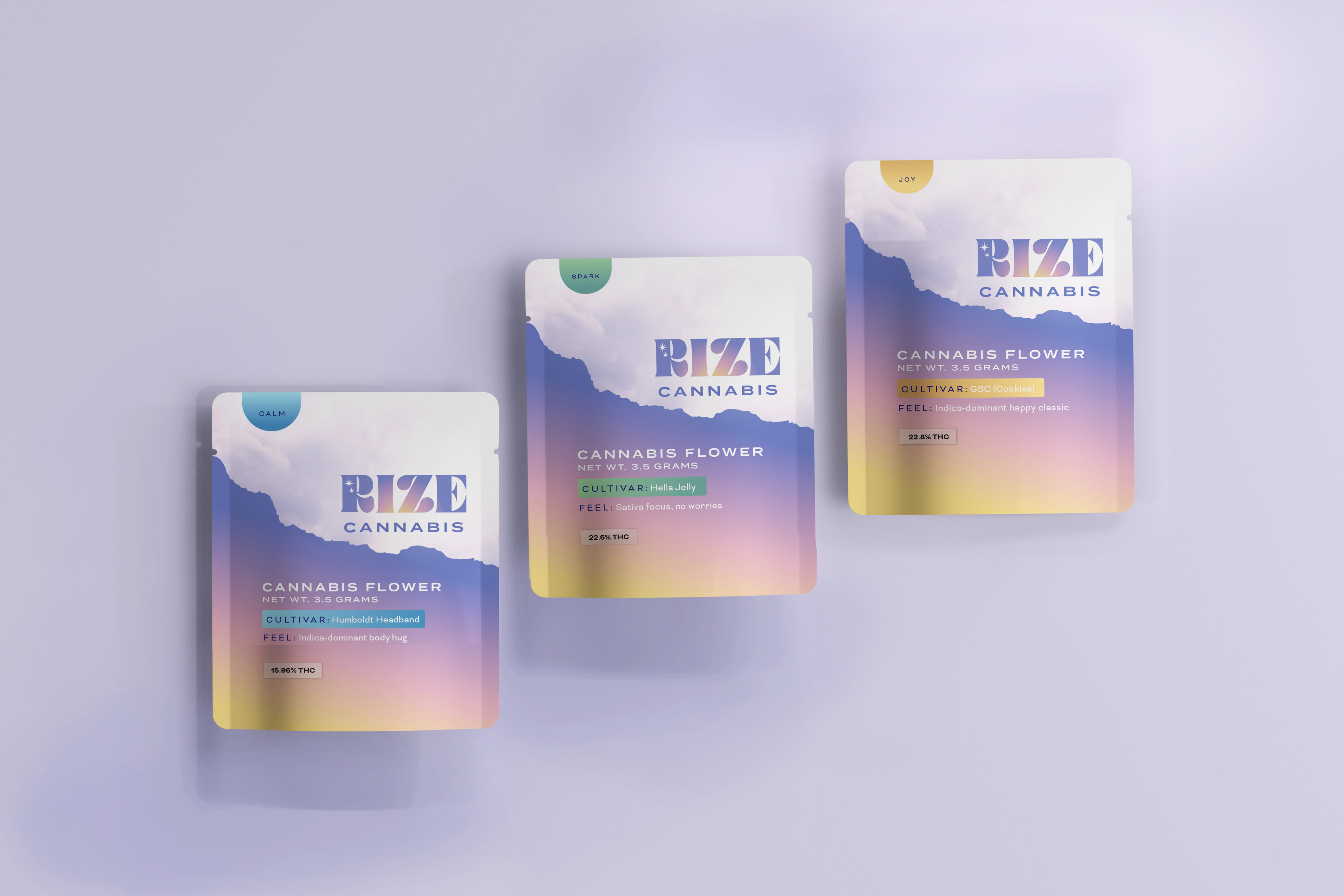
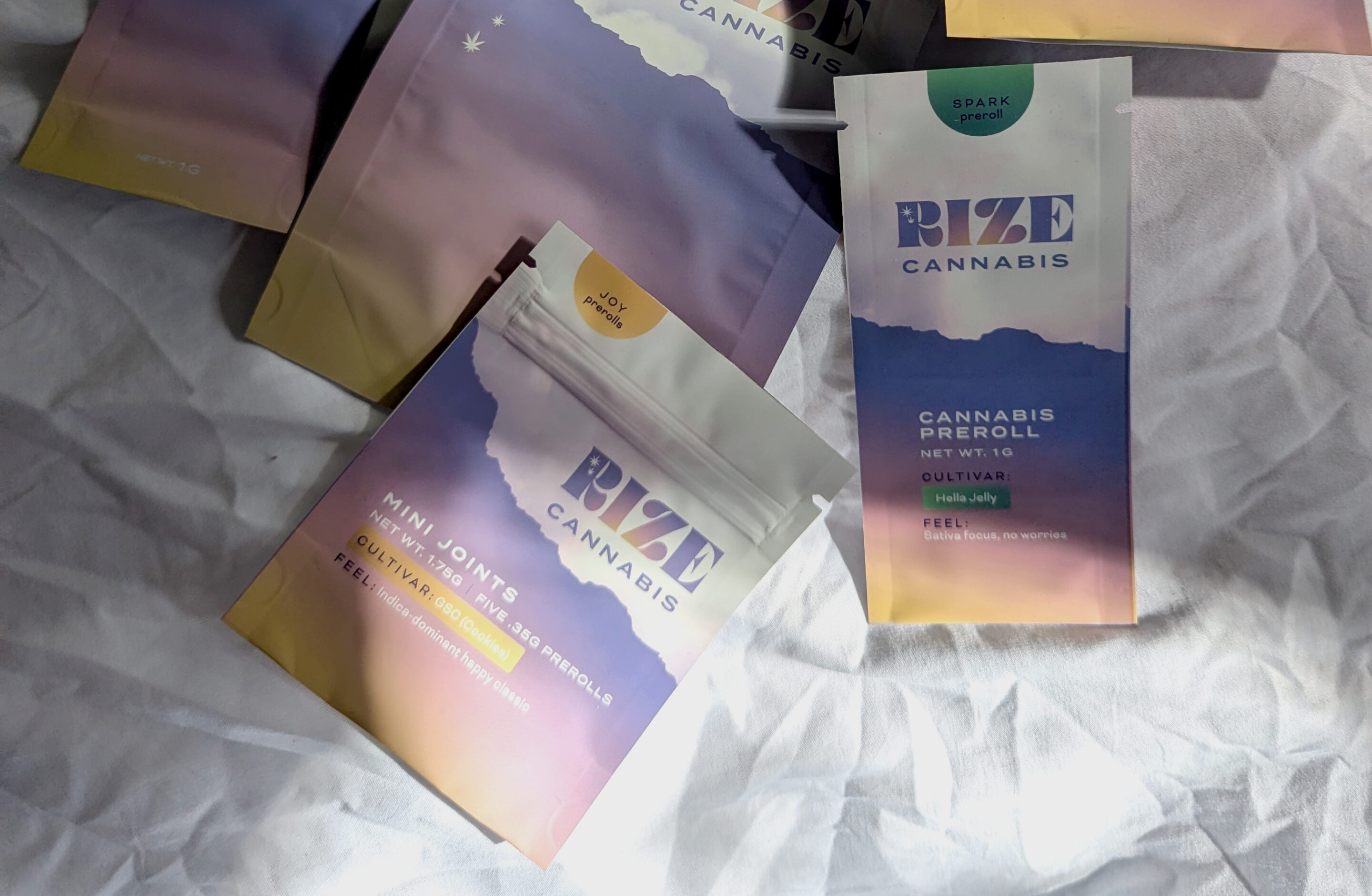
Packaging planning: coordinating client needs, vendor options, and visual appeal
Packaging is part design, big part problem solving. With my projects, I get very hands on. Sometimes that means measuring prerolls and making little mockups to see what size the bag should be.
Sometimes it’s about evaluating different price points for different options, local vs overseas printing in regards to project timelines and costs.
I advise and coordinate price quotes, coordinate printing options, and project manage the print job overall. It’s a ton of work, and not all designers take that on, but since most of my clients are small businesses, who are not used to doing packaging sourcing work, I’ve decided to make it a part of my service offering.
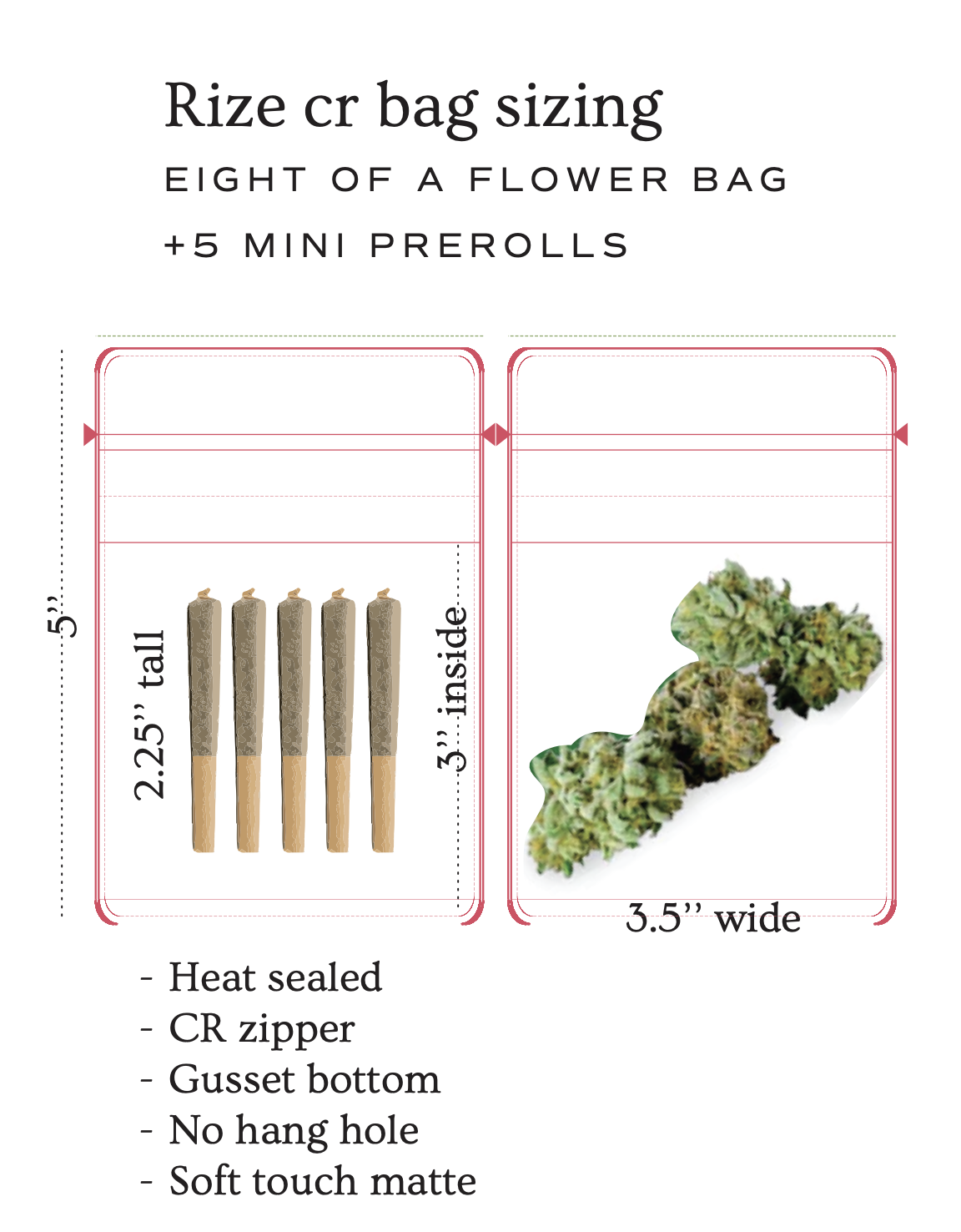
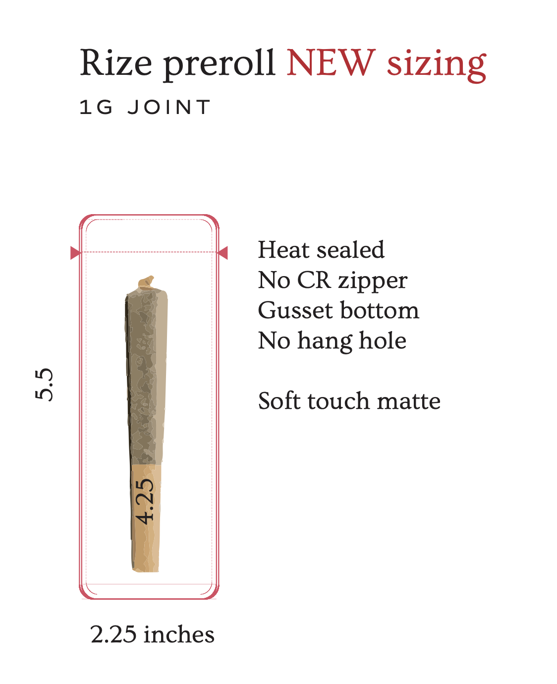
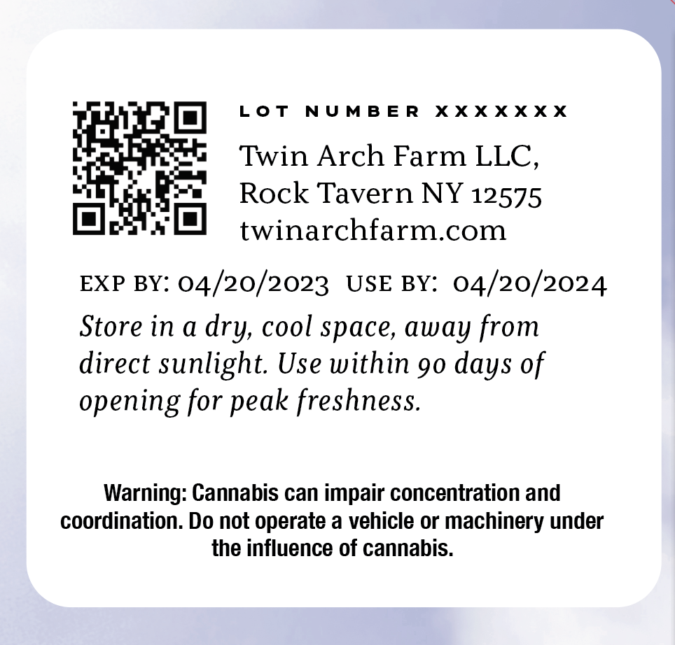
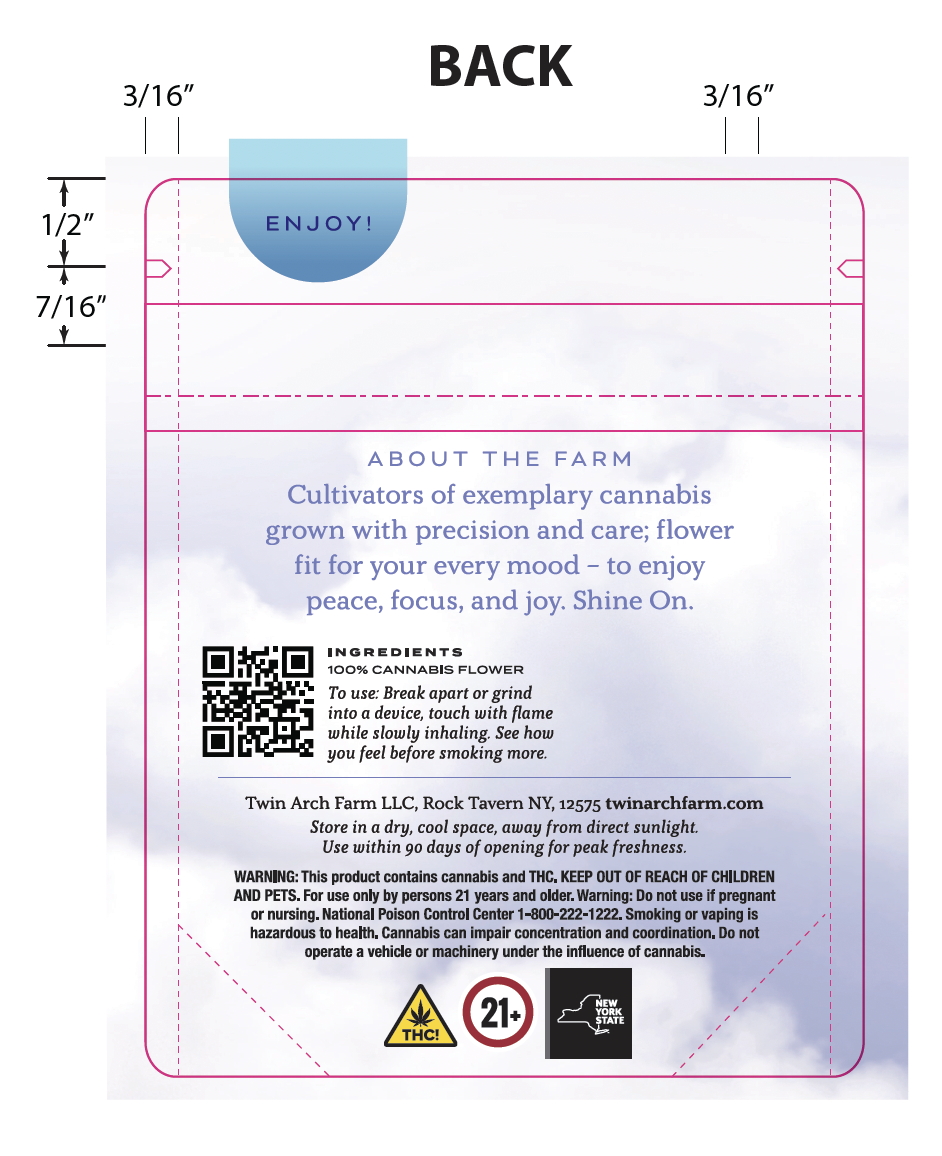
Cannabis packaging compliance
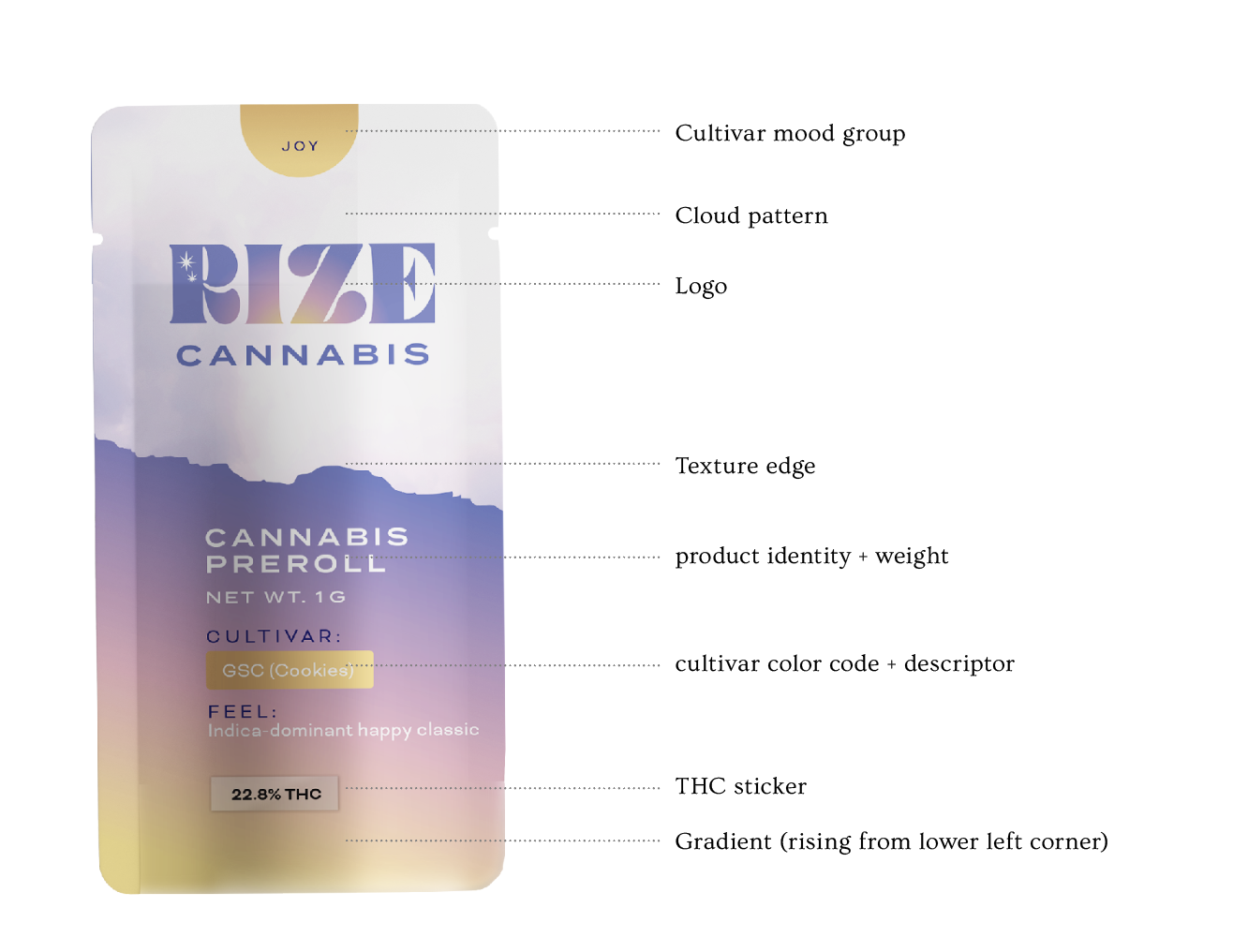
I’m no lawyer, but advising on content, cannabis packaging regulations, and practical matters is part of the process.
In New York, there are specific rules on what needs to be on the front of the package, and what can live elsewhere. The regs were so new at the time when we were working on them, that the rules changed while we were working on the project!
Ready to start your packaging project?
